A comprehensive series of test prompts designed to expose common AI image generation failures
Introduction
This document contains carefully curated prompts targeting the well-documented weak points of AI image and video generators. Each test is based on real user complaints about Midjourney, DALL-E, Stable Diffusion, Sora, Firefly, and other models.
We are currently evaluating the 🍌 Nano Bananа PRO model strictly in its default form. This means we are not utilizing any repeated inputs, optimized prompts, or concealed instructions to influence or enhance the performance. Our aim is to present a straightforward and transparent demonstration of what the model is capable of delivering in its original state. We want to make it clear that the outcome you see is purely the result of the model’s standard execution, without any behind-the-scenes adjustments or preconditioning - providing an honest and fair representation of its capabilities.
Why These Tests Matter
- Nearly 50% of AI-generated human images contain anatomical distortions
- AI models don't understand physics, causality, or 3D geometry
- Text generation remains a fundamental challenge
- Reflections and mirrors are a "blind spot" for all current models
Test Categories
- Human Anatomy (hands, fingers, teeth, ears)
- Text and Typography
- Physics and Causality
- Reflections and Mirrors
- Complex Compositions & Object Counting
- Style Imitation
- Macro & Micro Photography
✋ Section 1: hands and fingers
The classic AI failure point. Hands are small in training images, highly variable, and often obscured.
Test #1: fingers — basic
Difficulty: 🔴 HIGH
PROMPT:
Photorealistic portrait of a woman holding her hand up to her face, open palm facing the camera, all five fingers clearly visible, studio lighting, 8K resolution
What we're testing: Correct finger count (5), proper joint anatomy, phalanx proportions, fingernails on all fingers
Expected result: Exactly 5 fingers with correct anatomy — no fusion, duplication, or missing segments. Thumb positioned separately from other fingers. Visible knuckles and natural skin texture.
Result:
The model showed outstanding results, made no mistakes, and paid attention to details of the skin, face, and hair.
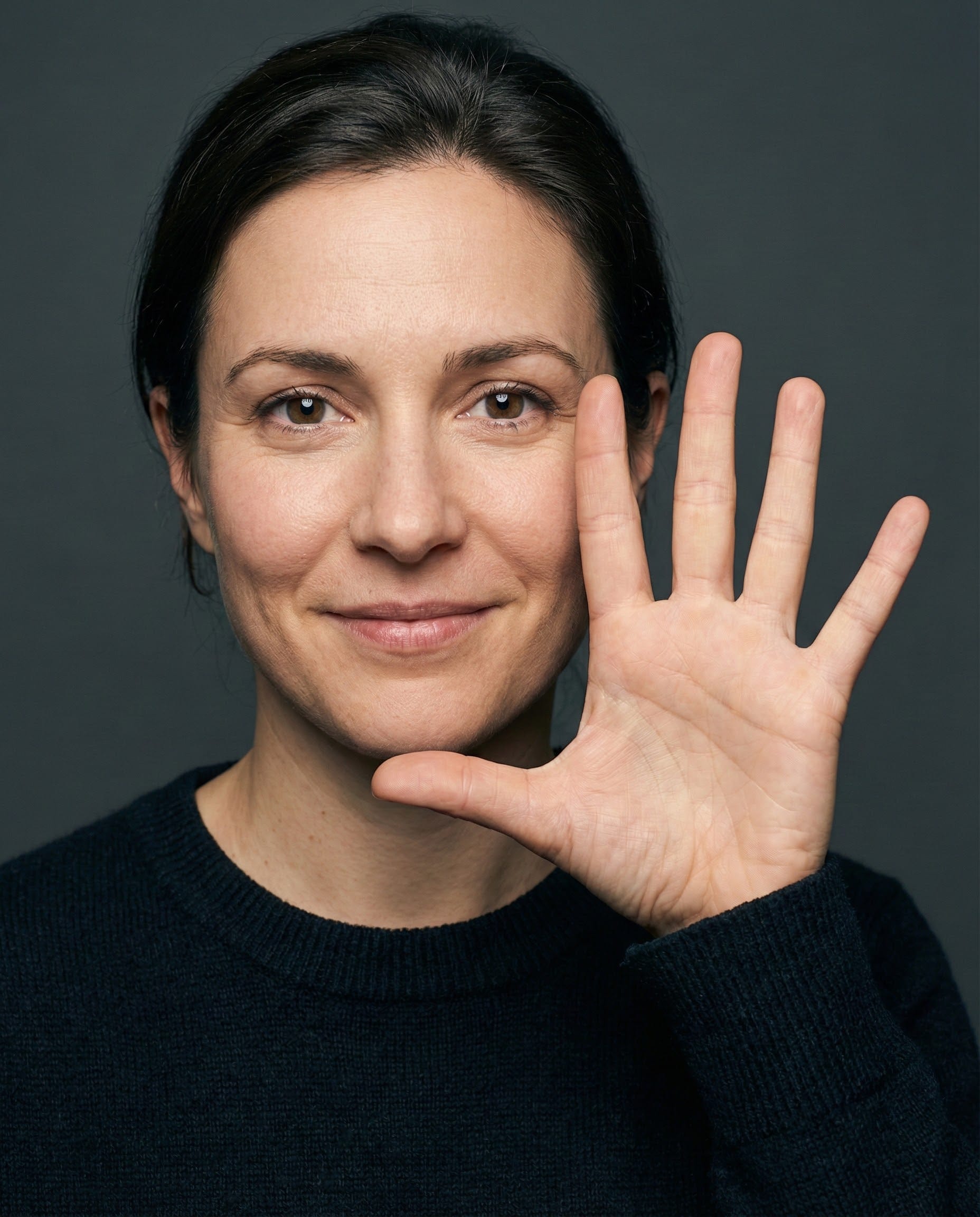
My Take: Incredible, it's impressive, the Nano Banana PRO model handled this task excellently. I especially liked how it worked out the skin, wrinkles, folds in detail, created natural lighting in the photo — this image is literally indistinguishable from a real studio photograph.
Test #2: Fingers — interlaced
Difficulty: 🔴 High
Prompt:
Close-up of two hands with interlaced fingers, like a prayer gesture, photorealistic, studio lighting, detailed skin texture 16:9, 8K resolution
What we're testing: Interlocking fingers from two different hands — one of the most challenging scenarios. AI often creates a "blob" of fingers or confuses which finger belongs to which hand.
Expected result: 10 fingers total, correct alternation (left finger, right finger, left finger...), anatomically correct bends at joints, clear distinction between the two hands.
Result:
The model accurately depicted the number of fingers and anatomy, rendered the skin in detail, but did not cross the index finger of the right hand between the other two.
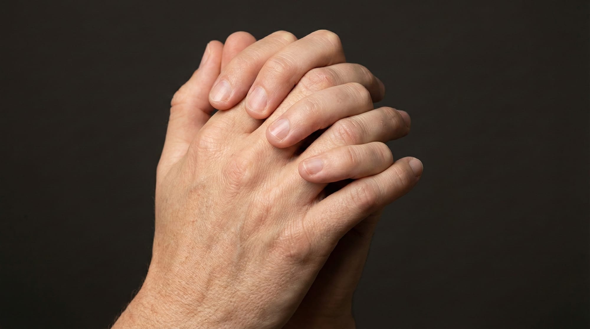
My Take: This image broke our brains while we were carefully examining the fingers. But overall, the model did well with the task. It correctly depicted the anatomy and the number of fingers. The only thing we didn’t like was that the thumb at the top of the image looks a bit unnatural, and one index finger is hidden under the other two. But I think with repeated prompting, this can be fixed.
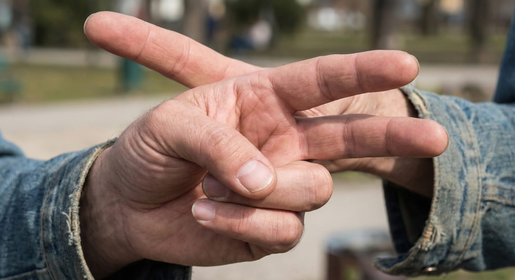
Test #3: Fingers — specific gesture
Difficulty: 🟡 Medium
Prompt:
Person showing the peace sign (Victory sign) with two fingers, remaining fingers curled into fist, close-up of hand, photorealistic, 8K resolution
What we're testing: Specific gesture with defined finger configuration. AI must understand which fingers are raised and which are bent.
Expected result: Index and middle fingers raised and spread in V-shape, remaining 3 fingers curled toward palm, thumb position natural.
Result:
The image matches the expected results. Good skin detailing, but possibly not a natural shadow.

My Take: I was able to get a quality result, for some reason on the second attempt. On the first try, the model drew two hands and failed the test—possibly because I was generating images in the same chat. For the sake of a clean experiment, I will carry out each separate generation in a new Gemini chat. Therefore, I consider the experiment successful, even if on the second try.
Test #4: Hands — object interaction
Difficulty: 🔴 High
Prompt:
Woman elegantly holding a wine glass by its stem with three fingers, photorealistic portrait, soft lighting, shallow depth of field
What we're testing: Hand-object interaction — fingers must correctly wrap around the object without clipping through it.
Expected result: Glass held by stem, fingers wrapping around it naturally without penetrating the glass, correct hand-to-glass proportions, natural grip pose.
Result:
Successful generation: the glass is held correctly by the stem with a natural, comfortable grip. Fingers are wrapped appropriately without touching the bowl, demonstrating proper technique and excellent hand-to-glass proportions. The result is visually accurate and aligns well with expected standards.

My Take: The model even took into account the reflection of the finger on the glass, impressive. The only thing I don't like is the slight blur on the fingers.
📝 Section 2: Text and typography
AI sees letters as combinations of lines, not meaningful symbols. Common errors: extra/missing letters, mirrored characters, gibberish.
Test #5: Text — short word
Difficulty: 🟡 Medium
Prompt:
Neon sign reading 'OPEN' against a dark background, glowing red letters, photorealistic, night scene
What we're testing: Short English word generation. Checking correct spelling and letter order.
Expected result: Clear readable 'OPEN' — 4 letters in correct order (O-P-E-N), no extra or missing characters, consistent neon glow style.
Result:
The OPEN sign looks accurate, with high detail and a beautiful night shot.

My Take: I am not a specialist in neon signs and can't say for sure whether the wires and other features are realistically placed, but the text itself is written without errors and the sign looks good.
Test #6: Text — Cyrillic (Ukrainian)
Difficulty: 🔴 High
Prompt:
Wooden sign reading 'ЛАСКАВО ПРОСИМО' (Welcome in Ukraine 🇺🇦 ) at the entrance of a traditional Ukranian wooden house in the Carpathians, photorealistic.
What we're testing: Cyrillic text — additional complexity due to fewer training examples compared to Latin alphabet.
Expected result: Correct Cyrillic spelling: Л-А-С-К-А-В-О П-Р-О-С-И-М-О (14 letters, 2 words), proper character forms, no Latin letter substitutions.
Result:
All the letters are displayed correctly, without errors. The wood texture, ethnic design, and the sign's font have been taken into account.
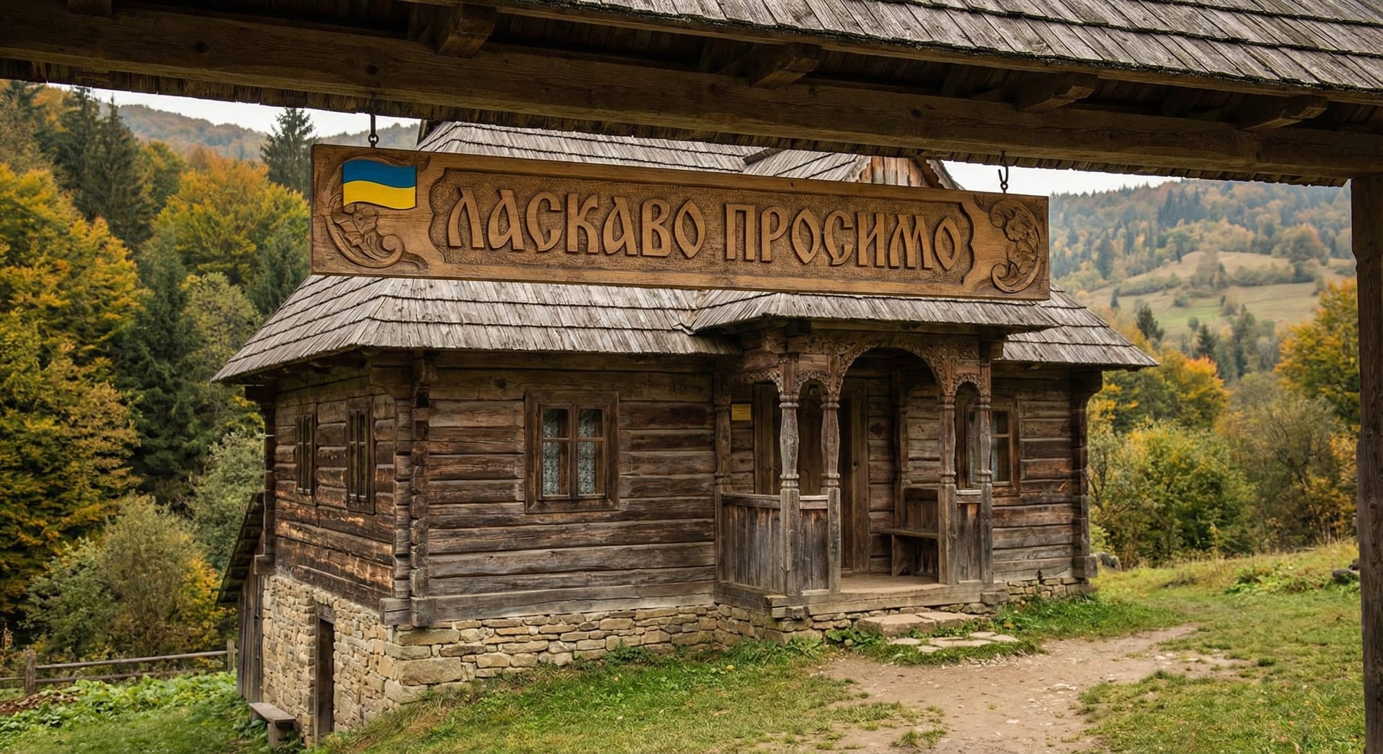
My Take: I asked my friend from Ukraine to assess the sign, and he confirmed that the model generated the text correctly without errors. It looks good and convincing. The only thing I didn't like in the photo was the detailing of the old ethnic house in the background - it looks like the model didn't put much effort into it. However, I have no complaints about the sign.
Test #7: Text — numbers
Difficulty: 🟡 Medium
Prompt:
Stadium scoreboard displaying match score: HOME 3 — 2 AWAY, close-up shot, photorealistic, evening game
What we're testing: Number generation and correct positioning. AI must understand scoreboard format.
Expected result: Readable digits 3 and 2 with correct separator, words HOME and AWAY spelled correctly, proper scoreboard layout.
Result:
- The numbers 3 and 2 are clear, legible, and correct
- HOME and AWAY are written without errors
- Separator is in place
- Bonus: match time (88:45) and goal details with names and minutes are added — everything is logical and without obvious text errors
- Photorealism and evening atmosphere are maintained
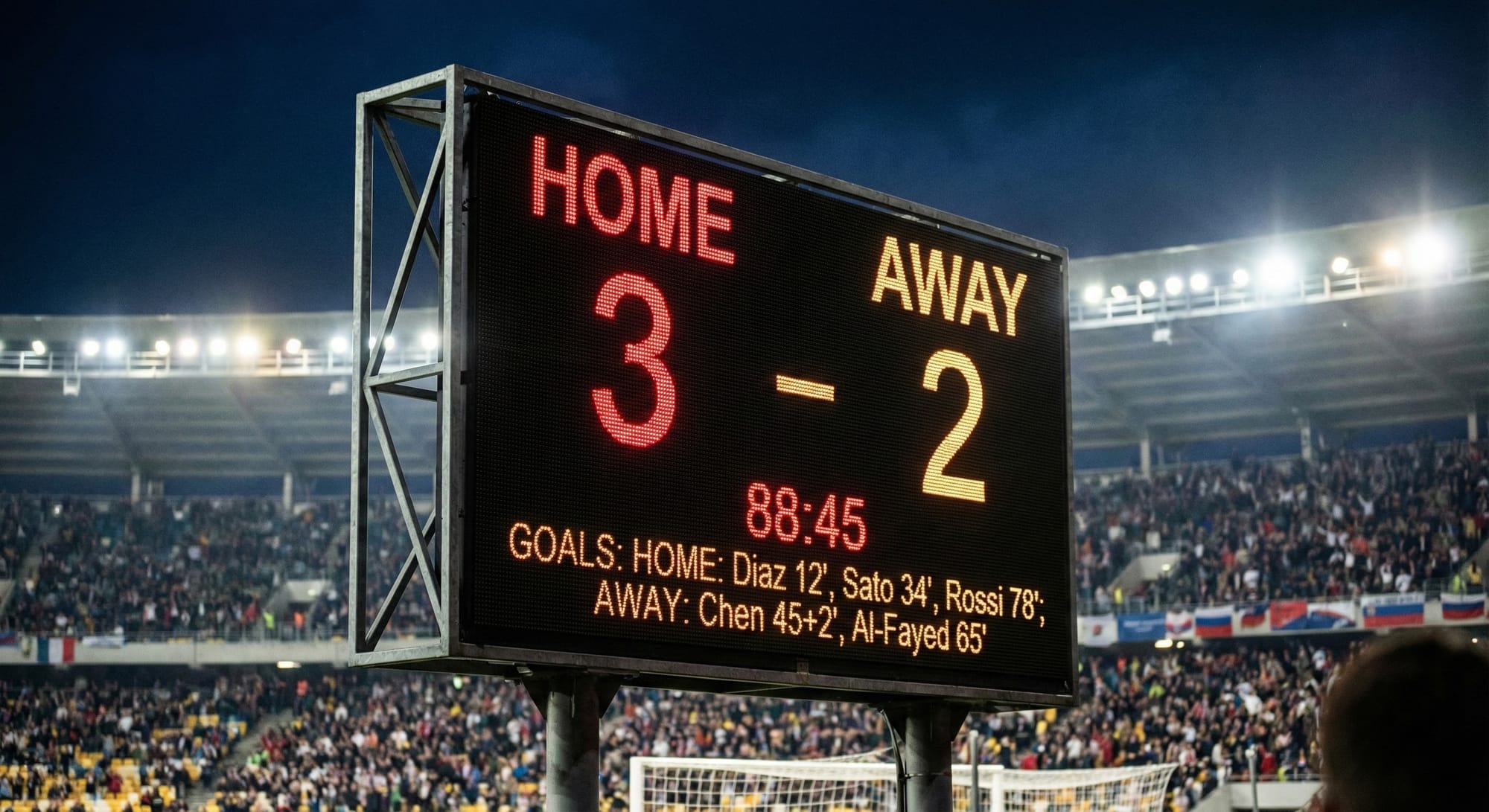
My Take: On closer inspection of the crowd, typical artifacts are visible. But for a test on text and numbers - the result is excellent. And as for a real photograph, the image looks more like a mockup rather than a real photo with text inserted in Photoshop. But I think this is all fixable through prompt experimentation.
Test #8: Text — long phrase
Difficulty: 🔴 High
Prompt:
Person holding a protest sign reading: 'Photography is the story I fail to put into words', street demonstration, photorealistic, daytime
What we're testing: Long phrase on a sign — checking text consistency throughout the entire message.
Expected result: Complete phrase without missing/extra words or letters, correct spacing between words, readable font, sign held naturally.
Result:
Everything is legible, without a single error. The line breaks are logical and easy to read. The quotation marks are in place, just like in the prompt. The handwritten style on the cardboard looks natural, although a bit sterile. Too perfect, as if the inscription was added in Photoshop.
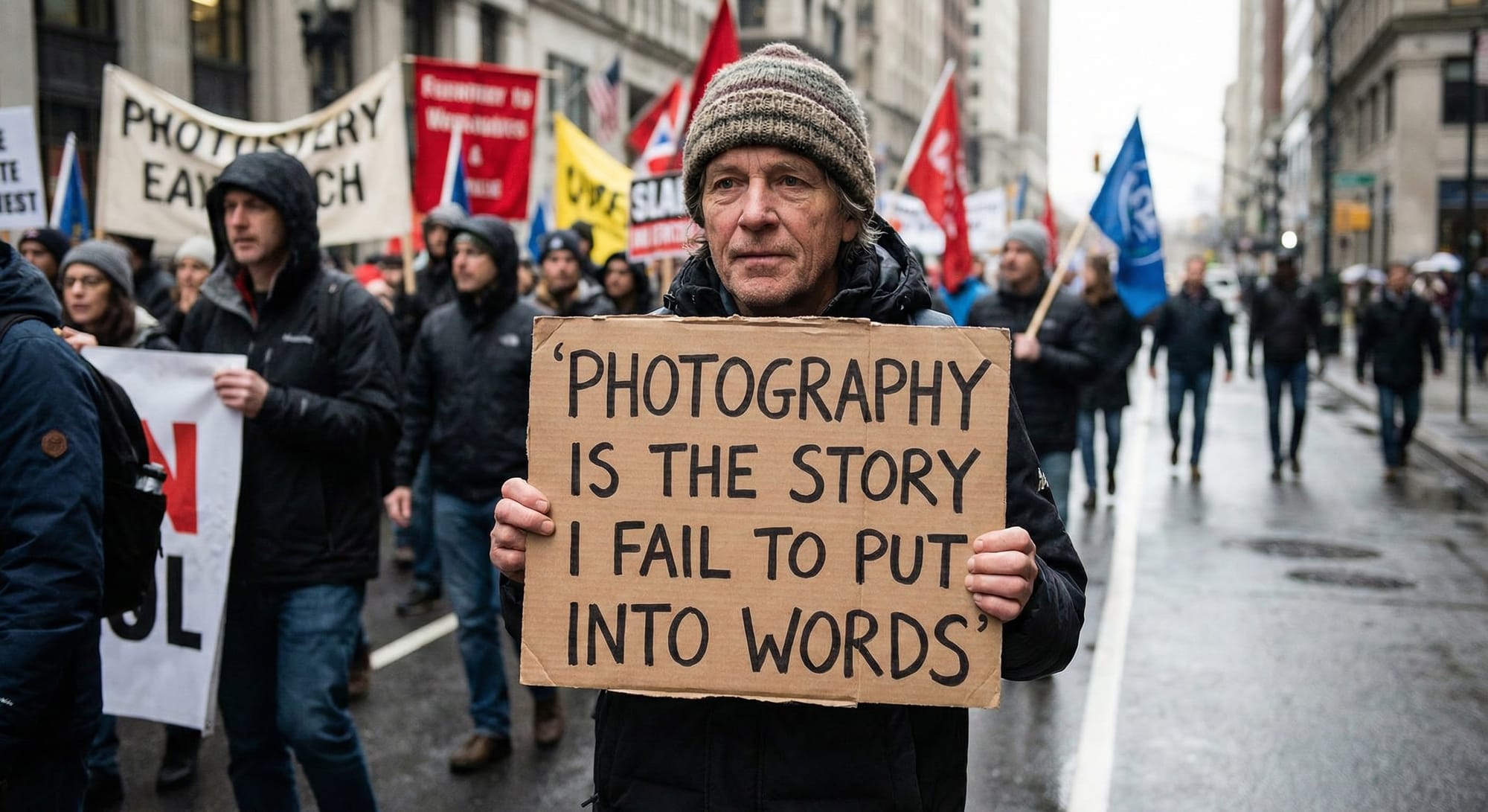
My Take: Photorealism is top-notch: skin texture, wet asphalt, depth of field - everything works. Minor drawback: the posters in the background contain typical AI "gibberish" (PHOTOSTERY, illegible text), but these are secondary, out-of-focus elements - not critical. As a test for long text - this is a benchmark result.
⚡ Section 3: Physics and causality
AI doesn't understand physical laws or cause-and-effect relationships. Objects may teleport, disappear, or defy gravity.
Test #9: Physics — gravity
Difficulty: 🟡 Medium
Prompt:
A glass of water is seen being accidentally knocked off the edge of a table, with the clear liquid beginning to spill out as it descends. Water splashes freely downward, and multiple droplets are visibly suspended in mid-air, frozen in time by the camera. The precise moment of the fall is perfectly captured, emphasizing the sudden motion and fluid dynamics. This scene is rendered in a photorealistic manner, utilizing high-speed photography techniques to highlight the clarity and intricate details. Displayed in ultra-sharp 8k resolution, every aspect—from the shimmering droplets to the transparent glass—is recorded with exceptional definition and realism.
What we're testing: Understanding of gravity: water should flow down, droplets should have falling trajectories, not float randomly.
Expected result: Water moving downward under gravity forming characteristic stream, droplets with clear falling direction, splash dynamics consistent with physics.
Result:
An extremely challenging test on liquid physics and "frozen" motion was executed impressively. A glass at the edge of the table, water splashing in an arc, droplets frozen in the air — everything matches the prompt. The transparency of the glass and water, light refraction, bokeh in the kitchen background — all technically excellent. The hand reaching for the glass adds drama and wasn’t even requested — a pleasant bonus.
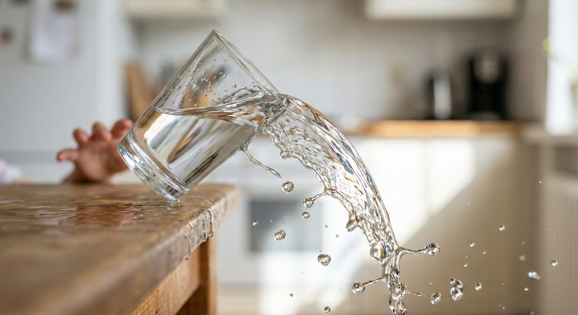
My Take: 🤔 What's a bit confusing: the splash trajectory is a little strange — the water arcs off to the side, though if it were falling straight down it would likely be more vertical. And the glass itself is suspended in a slightly unnatural pose — no longer on the table, but not quite falling yet. Minor details, but they catch the eye.
Test #10: Physics — reflections
Difficulty: 🔴 High
Prompt:
Woman standing in front of a large mirror wearing a red dress, full reflection visible, photorealistic, boutique setting
What we're testing: Reflections — AI's blind spot. Often the reflection doesn't match the original in clothing, pose, or even shows a different person entirely.
Expected result: Reflection identical to original: same red dress, mirrored pose, same accessories, same hairstyle, correct mirror geometry.
Result:
Mirrors are a classic "killer" for neural networks, but here Gemini handled it excellently. A woman in a red dress is standing with her back to the camera, and in two mirrors we see her face and the front of the dress — the reflection physics are accurate. The position of her hands in the reflection matches the original. A boutique, clothing racks, other shoppers in the background — the atmosphere is instantly recognizable.
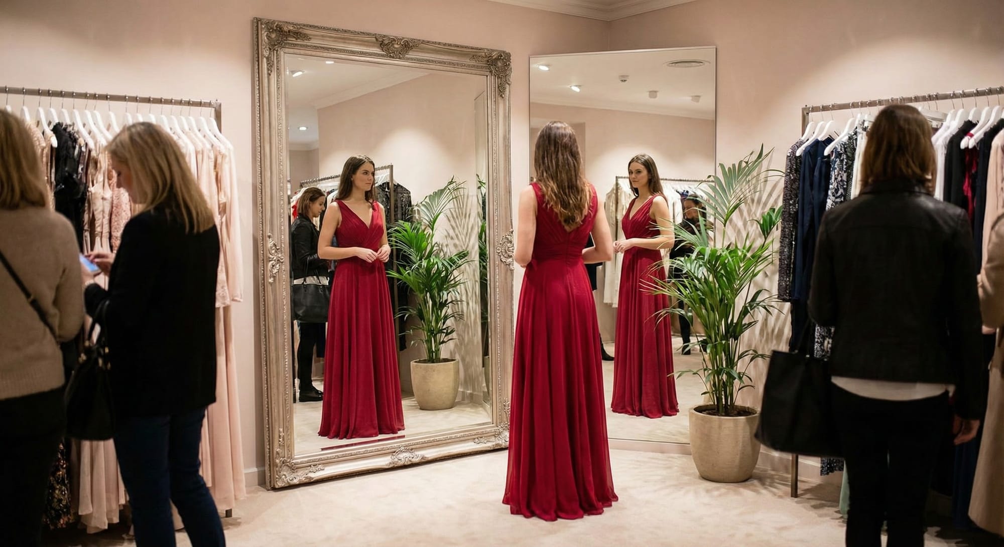
My take: 🔥 What’s impressive: Two mirrors with different frames, and both work correctly! You can even see the reflection of another person in black in the left mirror - that’s a high level of attention to detail. The fabric of the dress, the boutique lighting, the plants - everything is in place. Minor imperfections: The woman on the right by the rack looks a bit “blurry-weird” - a typical AI artifact on secondary characters. But it doesn’t spoil the overall picture. For a reflection test - this is an almost perfect result.
Test #11: Physics — shadows
Difficulty: 🟡 Medium
Prompt:
Person standing on a street on a sunny day, clear shadow cast on the asphalt, photorealistic, noon lighting
What we're testing: Shadows must be consistent with light source and proportional to the object.
Expected result: Shadow matches person's pose, shadow direction consistent with sun position (short shadow for noon), shadow attached to feet.
Result:
The prompt specifically requested "noon lighting," which means the sun should be at its zenith with shadows falling short and directly beneath the subject. Instead, the image shows a long shadow cast to the side — typical of early morning or late afternoon when the sun is low. The model ignored a key lighting parameter, making this a partial failure despite the otherwise high-quality output.
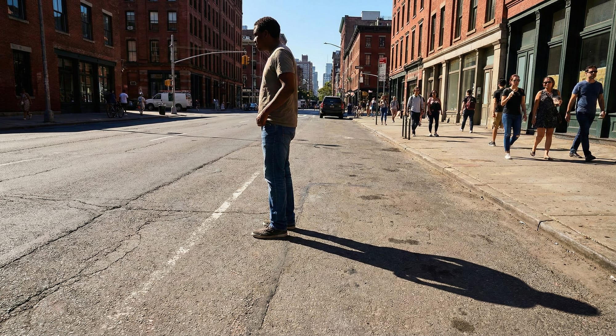
My take: If this test was simply about rendering "a clear shadow on asphalt" — it would be a Pass. The shadow is sharp, the asphalt texture is detailed with realistic cracks and road markings, and the overall scene looks like authentic New York street photography. But if we're testing the AI's understanding of time-of-day lighting physics — it's a clear Fail. Noon lighting = sun at zenith = short shadow under your feet. What we see here looks like 9 AM or 4 PM lighting. The model produced a beautiful, photorealistic image but didn't follow the prompt accurately — and prompt adherence is ultimately what matters in image generation testing.
Test #12: Physics — transparency
Difficulty: 🔴 High
Prompt:
Aquarium with a goldfish, water refracting the view behind the glass, fish partially behind aquatic plants, photorealistic, home setting
What we're testing: Correct visualization of light refraction in water, glass transparency, partial object occlusion.
Expected result: Visible light refraction in water, fish partially hidden by plants (not disappearing completely), glass is transparent, background distorted through water.
Result:
The composition and home setting are well-executed: bookshelf in the background, soft curtains, wooden stand, goldfish among aquatic plants. The prompt requirements are technically met. However, the water physics are unconvincing, which undermines the "photorealistic" claim.
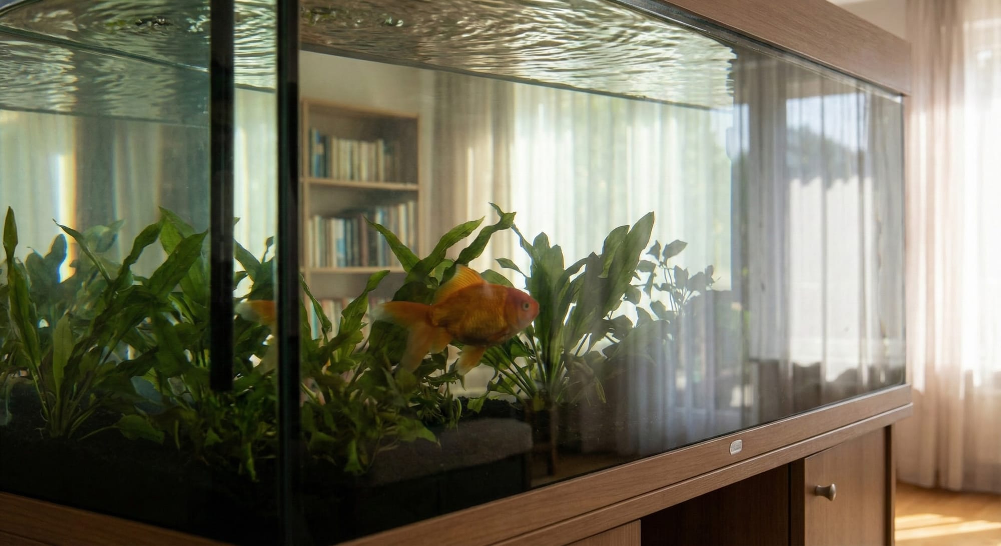
My Take: 🌊 Surface ripples look like a tiled texture—too uniform for real aquarium water, which has larger, gentler movement.💧 Water doesn't read as water—no clear refraction or distortion. Fish appears to float in air. Prompt asked for water refraction, but it's barely shown. Goldfish and plants look fine, and the vibe is cozy, but the water physics and material realism are weak. Pretty image, poor simulation.
👥 Section 4: Complex compositions
Multiple objects, exact quantities, interactions between elements — testing scene "understanding".
Test #13: Counting — people
Difficulty: 🔴 High
Prompt:
Exactly 7 people sitting around a round table at a business meeting, each wearing business attire, overhead view, photorealistic, corporate setting
What we're testing: Exact number of people. AI often adds extra people or "loses" some during generation.
Expected result: Exactly 7 people (not 6, not 8), each a distinct individual without fusions or partial figures, all properly seated.
Result:
The prompt specifically requested "exactly 7 people" — this is a counting test, and the model failed it. I count 8 people around the table. Everything else is well-executed: round table, overhead view, business attire, corporate setting with presentation screen, laptops, coffee cups. But the core requirement was not met.

My take: Counting remains one of the hardest challenges for image generation models. The scene looks like a premium stock photo — polished, professional, great lighting and composition. The diversity of the group, the realistic poses, the wood grain on the table, the presentation with charts in the background — all excellent. But "exactly 7" means exactly 7. Not 8. If you're testing whether an AI can follow precise numerical instructions, this is a clear failure. The model defaulted to "a group of business people" rather than counting to a specific number. For a counting accuracy test — this doesn't pass.
Test #14: Counting — objects
Difficulty: 🔴 High
Prompt:
Still life: exactly 4 apples, 3 pears, and 2 oranges on a wooden table, soft lighting, photorealistic, rustic setting
What we're testing: Accurate counting of multiple object types. AI doesn't understand the abstract concept of numbers.
Expected result: 4 apples + 3 pears + 2 oranges = 9 fruits total, each type easily distinguishable, no merged or partial fruits.
Result:
Let me count: 4 apples (mix of red and green) ✓, 3 pears (one on the left, two on the right near the cloth) ✓, 2 oranges (in the back) ✓. The count appears correct! Wooden table, soft window lighting, rustic stone wall, ceramic bowl, copper pot, linen cloth — all perfectly matching the prompt.
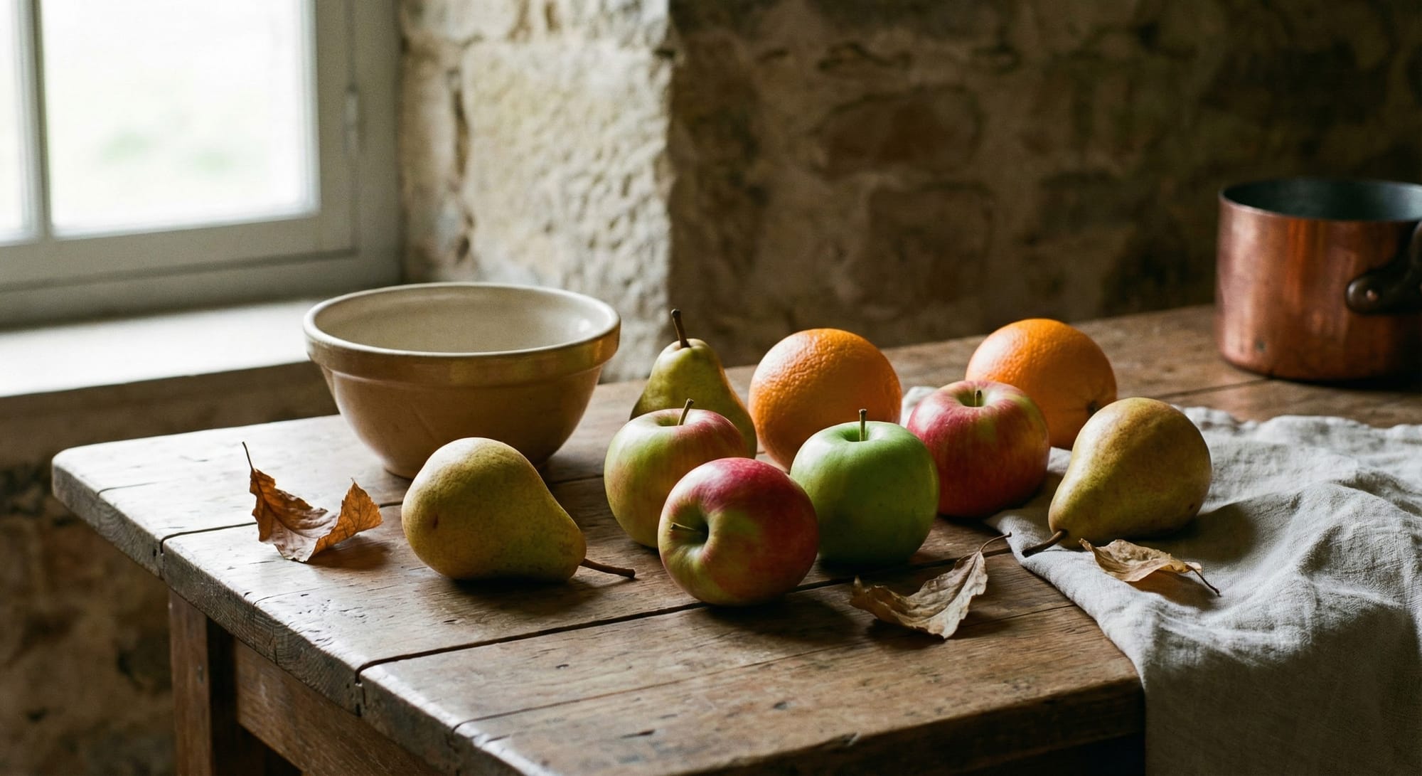
My Take: The fruit textures are stunning - you can almost feel the waxy apple skin and the grainy pear surface. The autumn leaves add a poetic touch that wasn't even requested. The light from the window creates natural shadows and highlights. This could genuinely pass as a professional food photography shot. 🤔 Minor observation: Some might debate whether one of the red-green fruits is an apple or a pear, but the overall count holds up on close inspection. For a counting + still life composition test - this is a strong pass.
Test #15: Interaction — passing object
Difficulty: 🔴 High
Prompt:
One person passing a book to another person, moment of transfer captured, both hands touching the book, photorealistic, library setting
What we're testing: Correct interaction between two people with a single object — proportions, contact points, hand positions.
Expected result: Book positioned between two people, one hand from each person touching the book, no hand "fusions", natural arm positions.
Result:
All prompt requirements met: two people, book being transferred, both hands touching the book simultaneously, photorealistic quality, classic library setting with wooden bookshelves and arched windows. The moment of transfer is clearly captured.
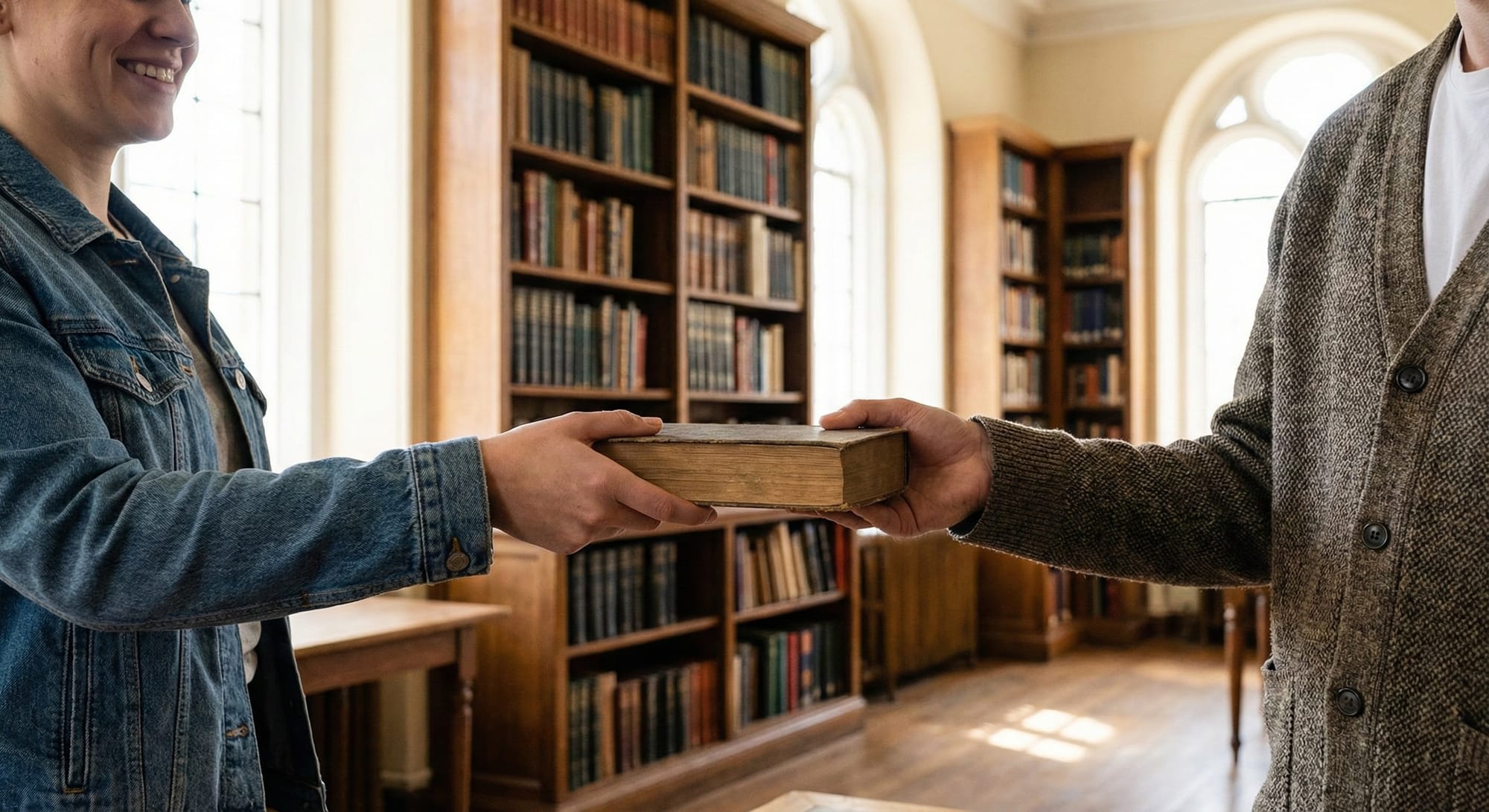
My Take: This is a technically difficult test - hand interactions with objects are notoriously hard for AI generators. Hands often come out with wrong finger counts, weird angles, or physically impossible grips. Here? Both hands look anatomically correct and naturally positioned on the book. What's impressive: The composition tells a story - you feel the moment. The smile on the left person, the old leather-bound book, the warm library atmosphere with soft backlight through tall windows. Fabric textures are excellent: denim jacket with visible stitching, tweed blazer with proper weave pattern. The background bokeh is natural. 🤔 Minor note: We don't see faces fully (cropped at mouth level), which might be intentional to avoid face-generation issues - a clever "safe" composition choice. Not a flaw, just an observation. For a hand-object interaction test - this is an excellent result.
🎨 Section 5: Style imitation
Testing ability to reproduce various artistic styles and techniques consistently.
Test #16: Style — pixel art
Difficulty: 🟡 Medium
Prompt:
Portrait of a samurai in 16-bit pixel art style, limited palette of 16 colors, sharp pixels without anti-aliasing, retro game aesthetic
What we're testing: Style consistency: all elements should be at the same resolution, no random smooth areas mixed in.
Expected result: Uniform pixels throughout the image, limited color palette visible, retro aesthetic maintained, no accidentally smooth gradients.
Result:
The image is clearly pixel art with visible pixels, limited color palette, and retro game aesthetic. Samurai portrait with Mt. Fuji and castle in background — compositionally solid. However, this is modern "16-bit inspired" art, not authentic hardware-accurate 16-bit graphics.
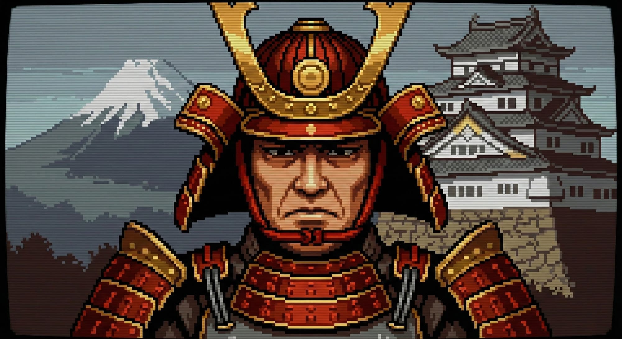
My Take: 🎮 Real 16-bit: SNES ran 256×224, Genesis 320×224. Sprites were small, faces super simple - think FFVI or Samurai Shodown. What we see: Pixel aesthetic, but much higher res and detail. Smooth shading, complex armor - far beyond what 16-bit could do. ✓ Right: Sharp pixels, retro vibe ✗ Wrong: Way too detailed and hi-res. Great modern tribute, but not hardware-accurate. More "16-bit inspired" than true SNES-era graphics.
Test #17: Style — watercolor
Difficulty: 🟡 Medium
Prompt:
Landscape with blooming cherry blossoms in Japanese watercolor style, soft color transitions, white paper areas showing through, traditional technique
What we're testing: Traditional technique imitation: characteristic "wet" edges, paint transparency, paper texture.
Expected result: Visible watercolor bleeds and gradients, paper showing through in areas, no hard outlines, soft diffused edges.
Result:
Soft transitions, white paper showing through, cherry blossoms, bridge, pagoda, misty mountains — everything's in place, the atmosphere reads instantly.

My take: Beautiful, but too "clean" and decorative - looks like an illustration for tea packaging rather than authentic Japanese watercolor. Traditional sumi-e or nihonga techniques have intentional imperfection: paint bleeds, uneven brush edges, "accidental" drips, asymmetry. Here everything is too neat and evenly distributed across the composition - you can feel the algorithmic hand, not a living brush. For greater authenticity it needs more "flaws": bolder empty spaces, rougher brushstrokes, less detail in the background.
Test #18: Style — double exposure
Difficulty: 🔴 High
Prompt:
Portrait of a woman with double exposure effect: face combined with autumn forest visible within the silhouette, artistic photography, moody lighting
What we're testing: Complex compositional technique requiring overlay of two images while maintaining readability of both.
Expected result: Clear face silhouette, forest organically integrated inside, both "exposures" distinguishable, artistic blend between elements.
Result:
Double exposure effect executed correctly, autumn forest visible within the silhouette, profile shot, moody lighting — all prompt requirements nailed.
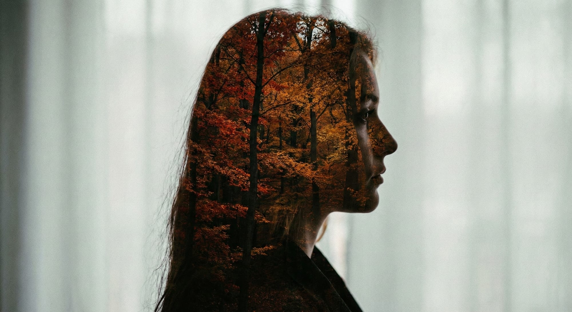
My Take: Wow! This is genuinely impressive - the kind of image that could appear in a photography portfolio or album cover without anyone questioning its authenticity. The blending is natural: forest fills the silhouette while the face profile remains readable, hair strands create organic edges where the two exposures meet. Autumn palette is rich but not oversaturated. If I'm being picky: the effect is almost too perfect and centered - real double exposures often have more unpredictable overlap and happy accidents. A slight asymmetry or unexpected element bleeding outside the silhouette would add authenticity. But honestly, this is nitpicking - for a technical/artistic composite test, this is near-flawless execution.
🔬 Section 6: Macro and micro photography
Extreme scales require specific visual characteristics: depth of field, detail level, proportions.
Test #19: Macro — insect
Difficulty: 🟡 Medium
Prompt:
Macro photograph of a bee on a flower, individual hairs visible on body, compound eyes detailed, pollen on legs, extreme detail, shallow depth of field
What we're testing: Correct insect anatomy (6 legs, 2 antennae), characteristic shallow depth of field of macro photography.
Expected result: Bee with 6 legs and 2 antennae, background blurred, foreground sharp, hair texture visible, compound eye structure apparent.
Result:
Individual hairs visible, compound eye detailed with hexagonal facets, pollen basket on the hind leg, water droplets on petals, shallow depth of field with creamy bokeh — all prompt requirements exceeded.
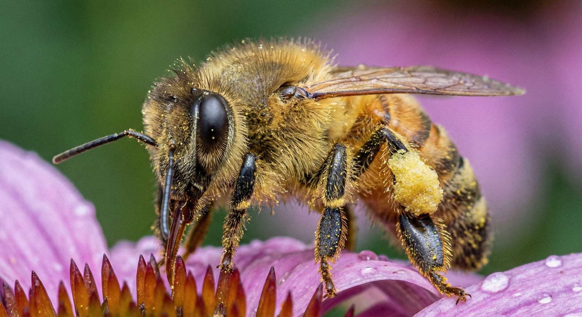
My Take: This is an exceptionally high-quality render, but here's the fascinating paradox: the human eye rarely encounters the macro world. We don't walk around seeing individual hairs on bee bodies or the texture of pollen grains - this perspective exists almost exclusively through specialized photography equipment. And that's precisely what makes macro subjects the perfect territory for AI generation: we lack the intuitive reference point to spot what's "wrong." If images like this had been published in the early internet era, they would have collected millions of likes and genuine amazement. Today, we've become desensitized to perfection. The truth is, only two types of people can truly judge this generation's accuracy: an entomologist who knows exactly how many leg segments a bee has and where the pollen baskets attach, or a professional macro photographer who's spent years observing how light diffracts through insect wings and how depth of field actually falls off at 1:1 magnification. For the rest of us - this is indistinguishable from reality.
Test #20: Macro — water drop
Difficulty: 🔴 High
Prompt:
Water droplet on a rose petal, the droplet reflecting the surrounding garden upside-down inside it, macro photography, morning light
What we're testing: Physically correct reflection/refraction inside the droplet, spherical droplet shape, optical properties.
Expected result: Spherical droplet shape, inverted reflection of surroundings visible inside, characteristic highlight/specular reflection on surface.
Result:
Water droplet on rose petal, inverted garden reflection inside, macro perspective, soft morning light with dew — all requirements met, and the physics of light refraction through a sphere is correct.
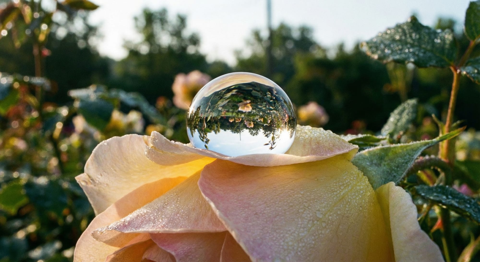
My take: 💧 This is a demanding optics test and Gemini understood the physics. A spherical water droplet acts as a natural lens, inverting whatever it "sees," and that's exactly what we get here: trees and sky flipped upside-down inside the sphere. The morning atmosphere is nailed with golden backlighting and tiny dew drops scattered across petals. One critique: the droplet feels almost too perfect - more like a glass lensball prop than an organic water drop. Real dew is smaller, less spherical, and sits differently on petal texture. But honestly, this is the kind of image photographers actually stage with lensballs anyway, so it works. For a refraction/reflection physics test - excellent execution.
Test #21: Micro — cellular structure
Difficulty: 🟡 Medium
Prompt:
Microscope view: plant cells with chloroplasts visible, cell walls clear, nuclei present, scientific visualization, bright field microscopy style
What we're testing: Biological accuracy: cell structure, characteristic organelles, microscopy color palette.
Expected result: Hexagonal/rectangular cells with visible walls, green chloroplasts inside, transparent cytoplasm, recognizable microscopy aesthetic.
Result:
Rectangular plant cells with clear cell walls, green oval chloroplasts distributed throughout, dark nuclei visible in multiple cells, bright field microscopy aesthetic, scale bar (50 μm), proper labeling — textbook-perfect execution.
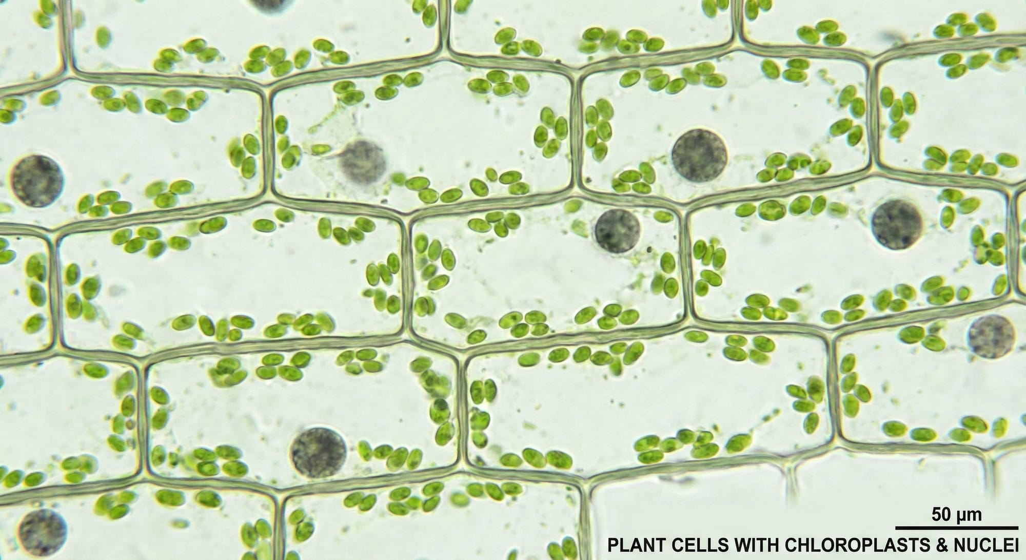
My take: I'll be honest - I'm not a biologist. And giving a comment on this generated photo would be beyond my expertise. I checked real photos; there is definitely a resemblance, but it's not one hundred percent. This image is more illustrative in nature and shows quite a few AI artifacts. It looks more like an illustration. But again, there are plenty of various images online, and they're all different. Still, I suggest we count this as a Pass. It's a quality visualization, at least on the level of explanation.
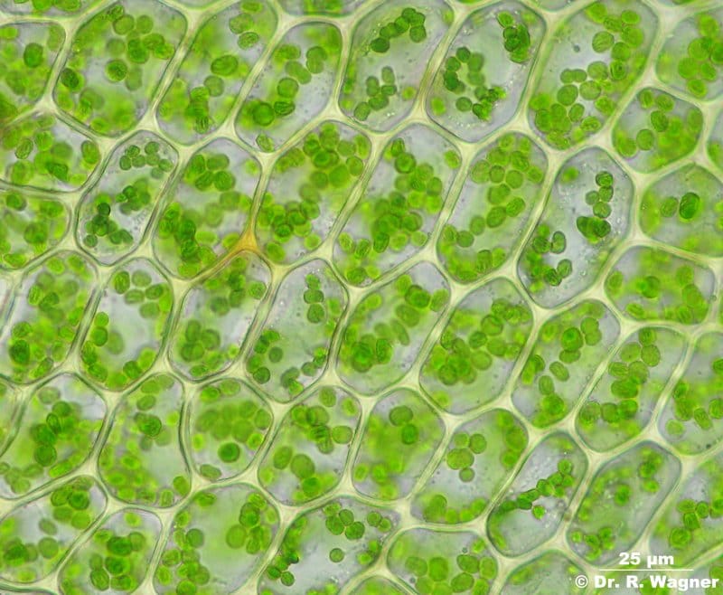
Here is what a real photo looks like for comparison:
☠️ Section 8: Extreme tests
Provocative prompts that break most models. Success here = breakthrough achievement.
Test #26: Extreme — mirror maze
Difficulty: 🔴 High
Prompt:
Person standing in a mirror maze, multiple reflections visible in all directions, all reflections consistent with each other, photorealistic, carnival setting
What we're testing: Multiple reflections with correct geometry — extremely challenging task for any AI model.
Expected result: Each reflection matches person's pose, reflections of reflections also correct, proper mirror geometry maintained throughout.
Result:
The prompt asks for "all reflections consistent with each other," but verifying this is practically impossible. A mirror maze is designed to disorient — angles are unpredictable, reflections bounce off each other chaotically. Without knowing the exact mirror layout, we can't confirm whether the physics are accurate or broken.
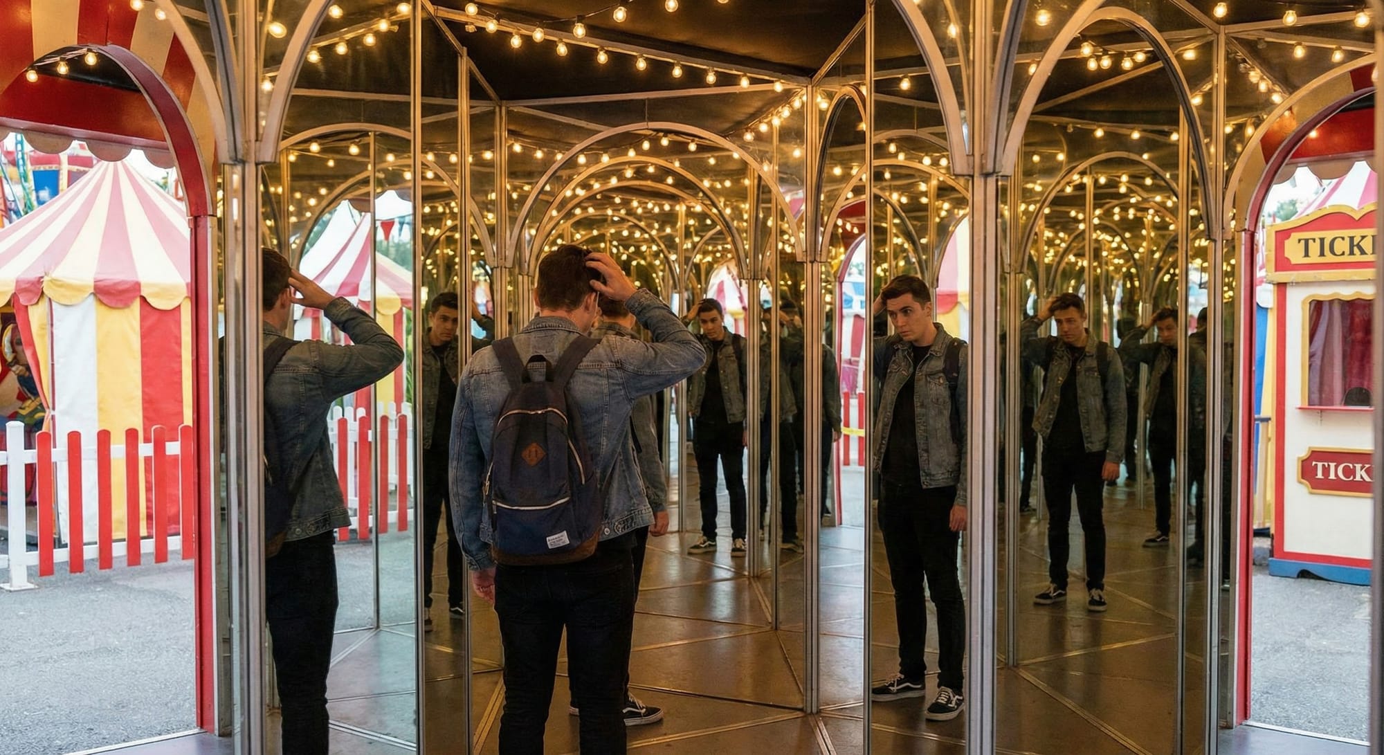
My take: What we can say: the carnival atmosphere is convincing (striped tents, string lights, ticket booth), the figure's clothing stays consistent across reflections, and the overall impression reads as "mirror maze." But whether each reflection is geometrically correct? No way to verify. General impression: Believable as a concept, impossible to validate technically. This prompt may be inherently untestable.
Test #27: Extreme — pianist hands
Difficulty: 🔴 High
Prompt:
Pianist playing a grand piano, both hands visible on keys, fingers pressing different keys, concert hall setting, photorealistic
What we're testing: Combination of problem areas: 10 fingers + interaction with many small objects (piano keys).
Expected result: 10 fingers total, each finger either on a separate key or raised, hands don't clip through keys, natural playing posture.
Result:
The prompt tests a specific challenge: 10 fingers interacting with piano keys. But the chosen camera angle makes verification nearly impossible — fingers overlap, shadows obscure the left hand, and the perspective distorts key proportions. This feels like the model picking a "safe" composition to hide potential errors rather than confidently rendering what was asked.
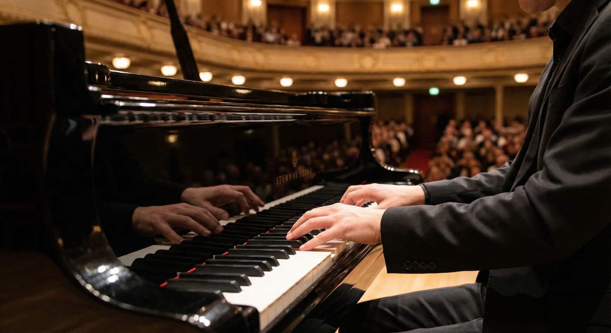
My take: A true pass would require a clearer angle: top-down or straight-on view where every finger and key is countable. What we got is a beautiful concert photo that conveniently avoids the hard parts of the test. So...Impressive atmosphere, but fails as a hand anatomy verification test.
Test #28: Extreme — group selfie
Difficulty: 🔴 High
Prompt:
Selfie of 5 friends, one person holding the phone, phone-holding hand visible, everyone smiling, phone screen showing the same photo, photorealistic
What we're testing: Recursion + multiple people + hand with phone — triple difficulty challenge.
Expected result: 5 distinguishable people, phone-holding hand anatomically correct, phone screen shows smaller version of same scene (recursive).
Result:
Counting: 5 people ✓. Phone held by guy in blue, hand visible with anatomically correct fingers and smartwatch ✓. Everyone smiling naturally ✘ The phone camera lost sight of one person ✓. Café/restaurant setting feels authentic.

My take: Overall, this is an impressive result. The only issue is that the curly-haired girl disappeared from the phone screen. Therefore, the test can be considered a failure. However, everything else, aside from this detail, was generated at a high level.
Test #29: Extreme — watch mechanism
Difficulty: 🔴 High
Prompt:
Disassembled mechanical watch, all gears and components laid out on a table, each part detailed, macro photography, watchmaker's workshop
What we're testing: Many small mechanical parts with correct geometry and consistent style.
Expected result: Gears with proper teeth, springs, screws — everything looks mechanically correct and stylistically coherent.
Result:
Gears with visible teeth, mainspring spirals, screws, plates, tweezers, screwdrivers, timing machines in background — the scene reads as an authentic watchmaker's workshop. Macro perspective with shallow depth of field, coherent metallic color palette (silver, brass, gold tones).
Visually stunning, mechanically unverifiable. The aesthetic test passes; the engineering accuracy test requires an expert we don't have.
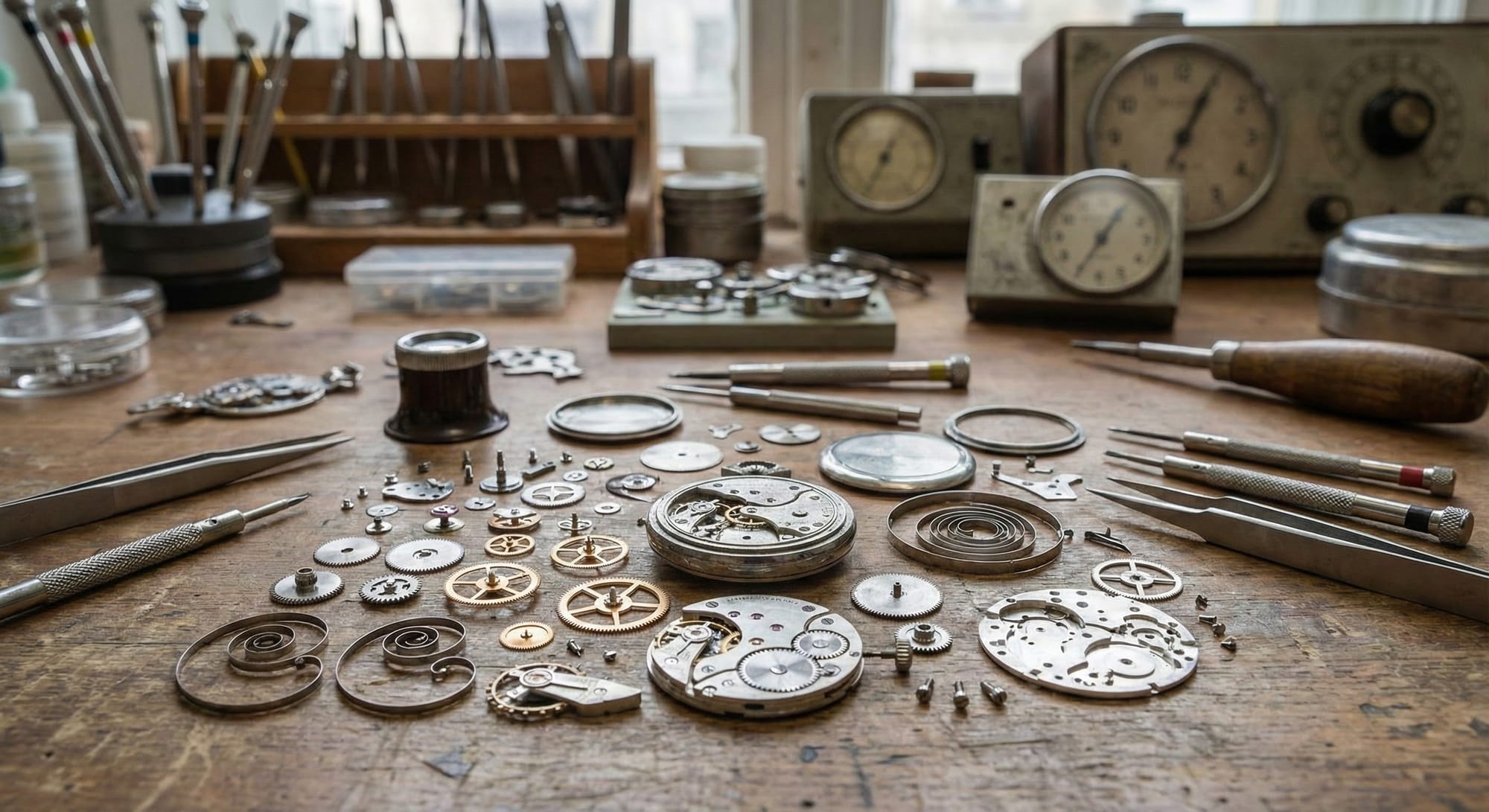
My take: I'll be honest - I'm not a watchmaker. I have no idea whether these specific gears would actually mesh correctly, whether the mainspring has the right number of coils, or if those bridge plates belong to any real caliber movement. I've probably seen disassembled watch mechanisms twice in my life, both times in pictures. And that's exactly the point. This is another example of AI choosing a battlefield where most humans are blind. We don't have the visual vocabulary to say "that escape wheel is wrong" or "balance springs don't look like that." The image feels mechanical, feels precise, feels like horological expertise - and for 99% of viewers, that's enough. A master watchmaker might look at this and immediately spot nonsense: gears that couldn't turn, parts from different movement sizes mixed together, components that don't exist. But for the rest of us, this is indistinguishable from a real workshop photo.
Test #30: Extreme — crowd
Difficulty: 🔴 High
Prompt:
Crowded subway station during rush hour, hundreds of people, each individual unique, no one merging with neighbors, photorealistic, Tokyo metro
What we're testing: Generating large number of unique people without "clones" or anatomical errors.
Expected result: Many unique individuals, varied clothing, no fused figures, correct anatomy for all visible people, realistic crowd density.
Result:
The prompt requirements are technically met: crowded Tokyo subway (Shinjuku Station signs visible), rush hour atmosphere, hundreds of people in business attire with masks. However, upon closer inspection, the image reveals numerous artifacts and anatomical errors.
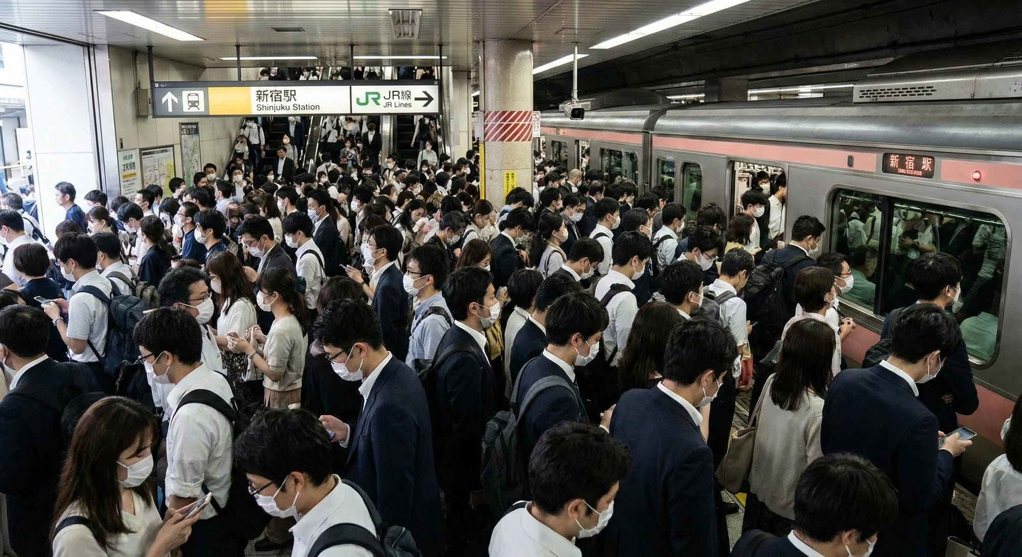
My Take: AI still hasn't mastered crowds. With the naked eye, you can instantly spot artifacts: hands merging with bodies, faces blending into neighbors, limbs that don't quite connect properly. The background turns into visual mush where too many small details compete for resolution — people become abstract shapes rather than individuals. But let's give credit where it's due: this is leagues ahead of what models generated just two years ago. Back then, crowds were nightmare fuel - melting faces, shared limbs, clone armies. Here, the overall impression works from a distance. The station signage is legible (JR Lines), the train design is accurate, the masks and business attire create authentic Tokyo rush hour atmosphere. The truth is: rendering 100+ unique humans without errors is still beyond current capabilities. Each person needs correct anatomy, unique features, proper spatial boundaries and that complexity multiplies exponentially. Give it another year or two, and we'll likely see pixel-perfect crowds. Impressive progress, but crowds remain an unsolved problem. The "zoom test" fails immediately.
Bonus: Additional creative tests Nano Banana PRO VS Sora
I had a set of creative prompts that I used with Sora, let's compare how the same prompt is generated with Nano Banana PRO.
Glamorous Virtual Diva
Prompt:
Result:
My take: Nano Banana PRO looks significantly more realistic and higher in quality in terms of details. Excellent result.
Elegant Chongqing Hot Pot
Prompt:
Result:
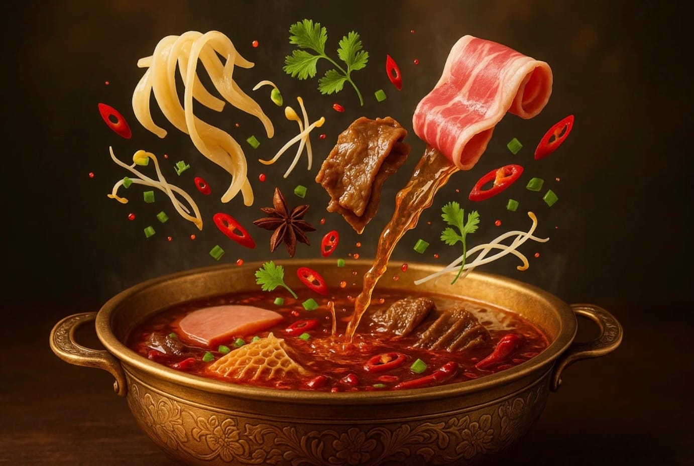

My take: As you can see, the food looks much more detailed, tastier, and more natural. Great job by Nano Banana PRO. Sora did well too, but significantly worse. Especially considering that such images will be used for the restaurant business.
Sugary Gummy Phone
Prompt:
Result
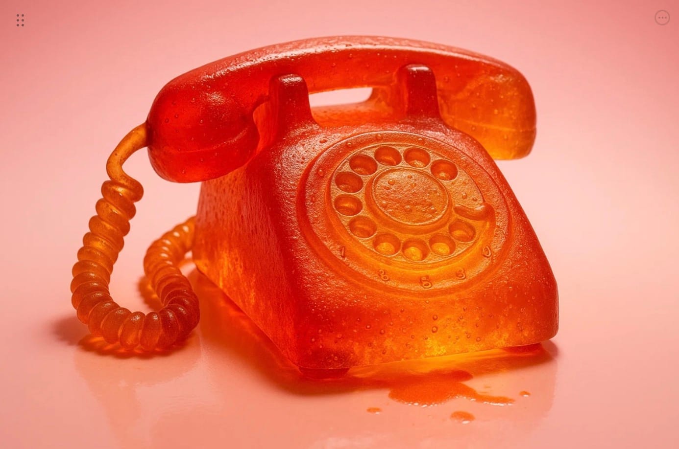
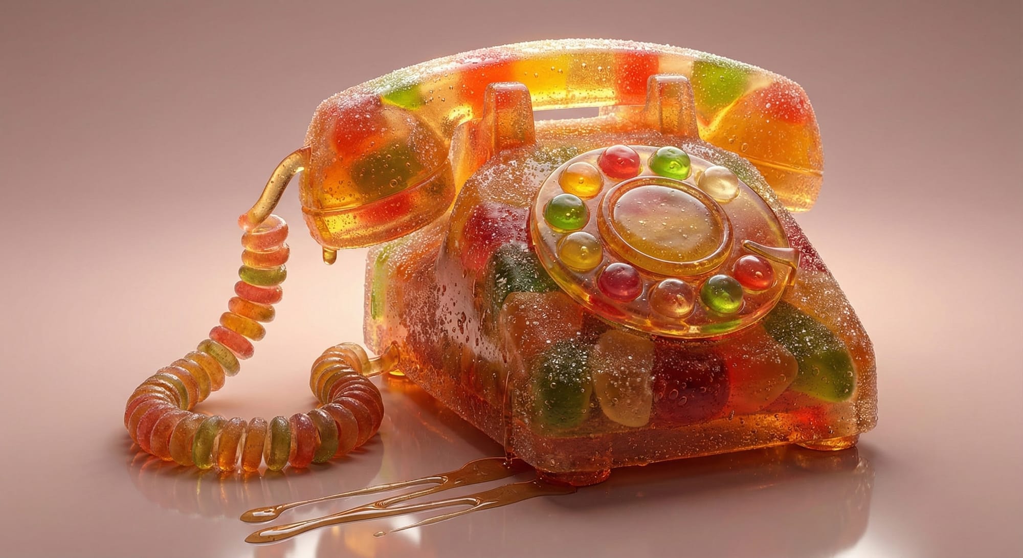
My take: Both images are good in their own way. But we see again the trend that Nano Banana PRO significantly better handles detail and generates realism much more effectively, taking into account shadows, highlights, and lighting, than Sora.
Candy Glam Grillz
Prompt:
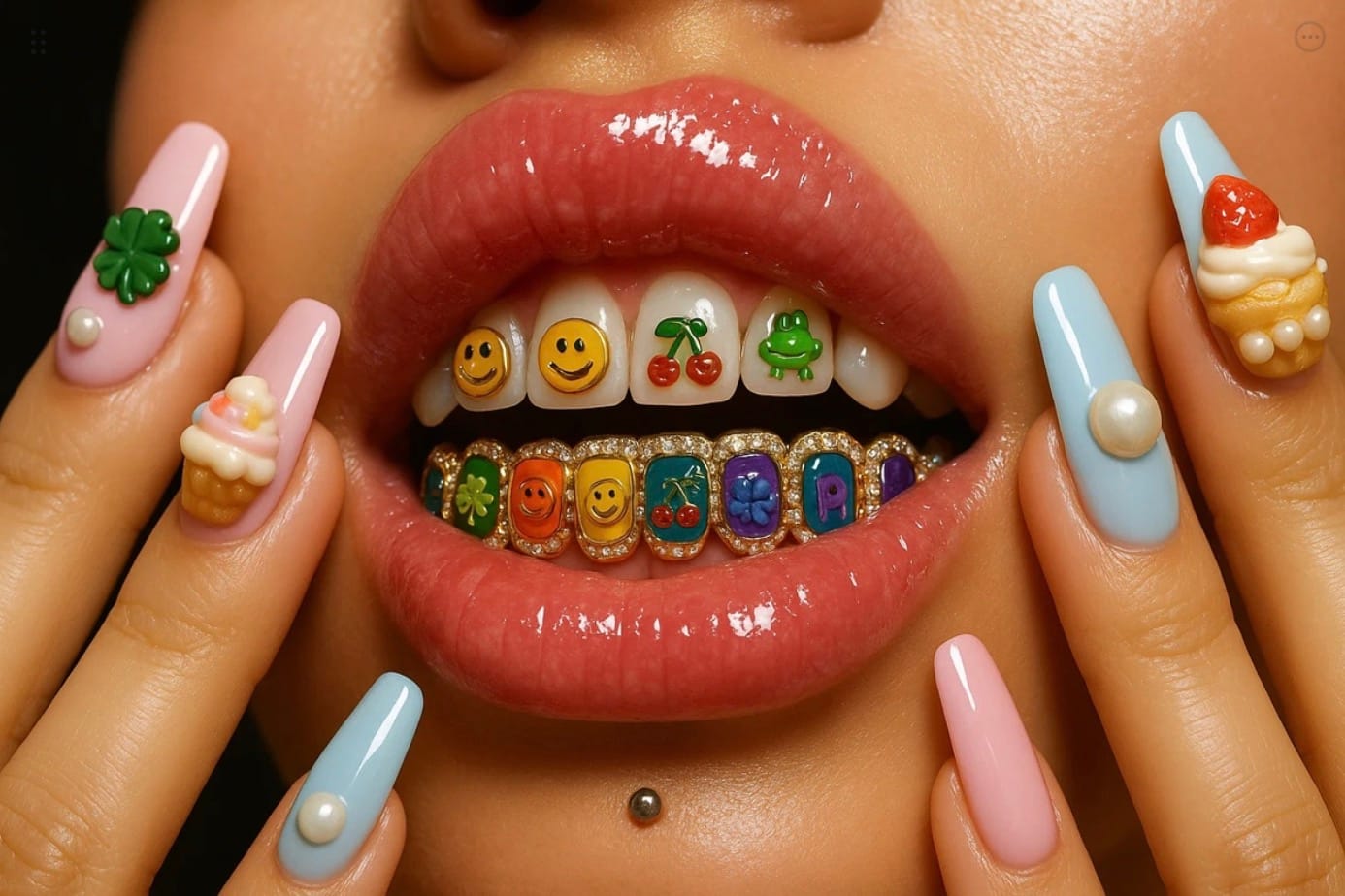
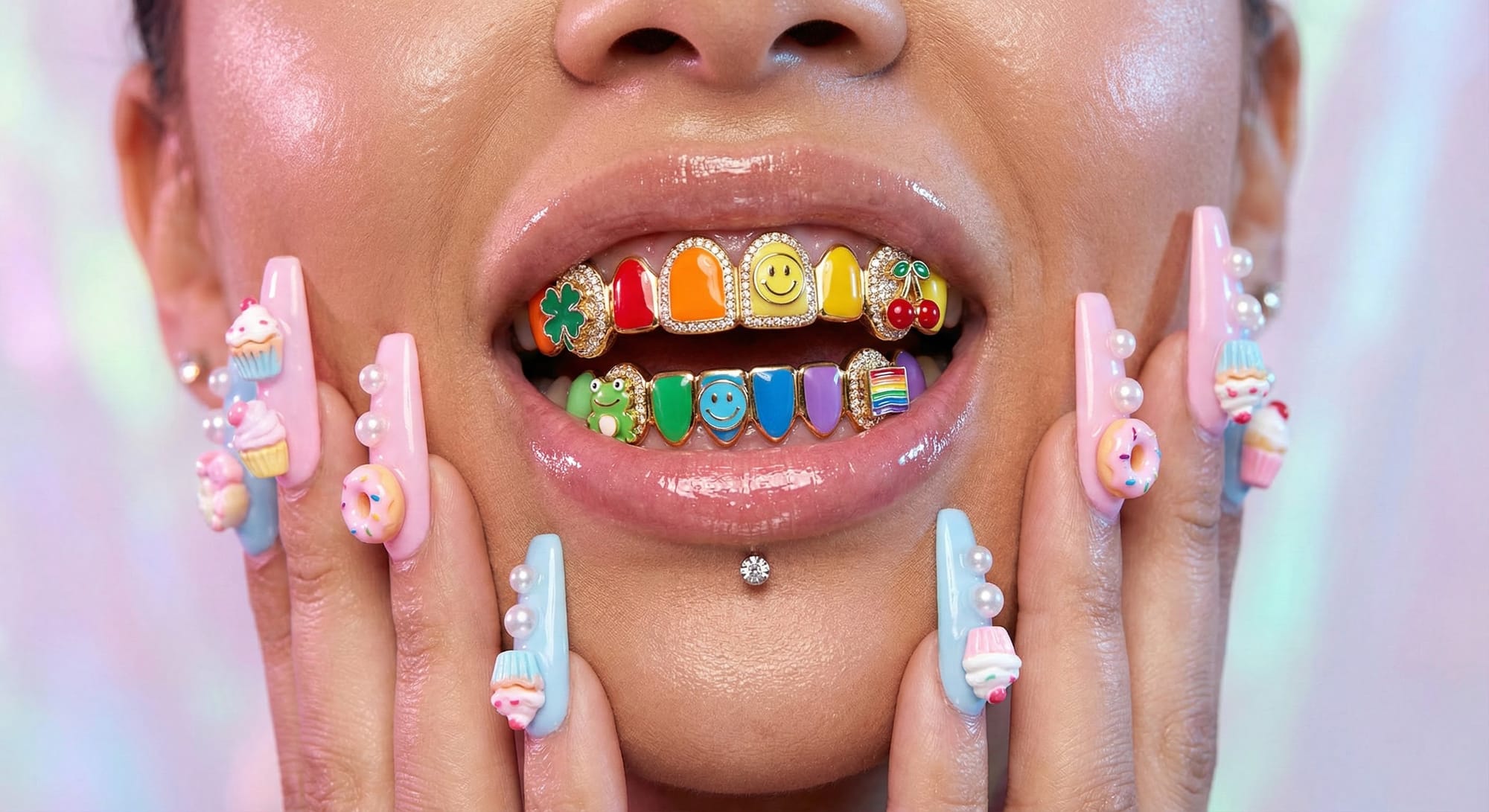
My take: The situation repeats itself in yet another test and comparison of Sora and Nano Banana Pro. Nano Banana PRO works significantly better with detail. It is very good at realism, especially with human skin, lighting, and refined detailing in small elements. You see everything yourself.
If you want more similar creative prompts, I have a book you can download: Create Viral, High-End Images with AI Prompts. It contains over 50+ cool prompts.
The comparison breakdown
| Test | Sora | Nano Banana PRO | Winner |
|---|---|---|---|
| Glamorous Virtual Diva | Generic, flat | Sharp details, realistic glass | 🍌 Nano Banana PRO |
| Chongqing Hot Pot | Decent composition | Mouth-watering realism | 🍌 Nano Banana PRO |
| Gummy Phone | Creative but soft | Crisp textures, proper lighting | 🍌 Nano Banana PRO |
| Candy Glam Grillz | Acceptable | Stunning skin, perfect details | 🍌 Nano Banana PRO |
Score: 4-0 in favor of Nano Banana PRO
My take
I'll be blunt: this comparison isn't even close.
Looking at these results side by side, there's a clear and consistent pattern — Sora feels like watching content in SD resolution, while Nano Banana PRO delivers Ultra HD quality. And I'm not exaggerating for effect. The difference is that obvious.
Let me break down what I'm seeing:
🎯 Detail handling: Sora produces images that look... fine. Acceptable. The kind of output you'd get from a mid-tier generator two years ago. But Nano Banana PRO? Every surface has texture. Every light source creates proper reflections. Every material behaves the way it should — glass looks like glass, skin looks like skin, food looks edible.
🔬 The zoom test: Here's a simple experiment: zoom in on any Sora image, then zoom in on the Nano Banana PRO equivalent. Sora falls apart — details become muddy, edges get soft, textures turn into noise. Nano Banana PRO holds up. You can crop, zoom, and examine, and it still looks intentional.
🍜 The hot pot test tells the whole story: This prompt was a monster — detailed instructions about ingredients, lighting, composition, textures. Sora delivered a competent food photo. Nano Banana PRO delivered something a restaurant would actually pay money to use in their advertising. The beef looks juicy. The soup looks hot. The steam looks real. That's not a small difference — that's the difference between "AI-generated" and "professional photography."
💄 Human elements: The Candy Glam Grillz test is where the gap becomes almost unfair. Sora's skin looks like plastic. Nano Banana PRO's skin has pores, has subsurface scattering, has that subtle glow that makes you forget you're looking at a generated image. The grillz have individual reflections. The nails have depth. It's genuinely impressive.
The honest assessment
That said, what I observed is consistent across all four creative tests:
- Sora: Gets the concept right, delivers acceptable results, struggles with fine details
- Nano Banana PRO: Gets the concept right, delivers exceptional results, excels at fine details
If I had to describe it in one sentence: Sora gives you a draft. Nano Banana PRO gives you a final render.
For anyone working in advertising, product photography, or any context where image quality matters — this comparison makes the choice obvious. The detail gap isn't subtle. It's not something you need to squint to notice. It's the difference between "that's clearly AI" and "wait, is that real?"
Sora (legacy version): Functional but dated. Feels like 2023-era generation quality.
Nano Banana PRO: Current-gen capability with genuine photorealistic potential. The kind of output that makes you reconsider what "AI-generated" means in 2025-2026.
The comparison speaks for itself. Four tests, four clear wins, zero ambiguity. 🍌
🍌 Nano Banana PRO Crash Test — Final Results
📊 Scoring system
We used a 10-point scale to evaluate each test result:
| Score | Rating | Criteria |
|---|---|---|
| 9-10 | ✅ Excellent | Prompt requirements fully met, photorealistic quality, no visible artifacts |
| 7-8 | ✅ Good | Minor imperfections that don't affect overall perception, high quality |
| 5-6 | 🟨 Partial Pass | Noticeable issues, but core task accomplished, room for improvement |
| 3-4 | ❌ Fail | Critical errors: wrong counts, broken physics, prompt ignored |
| 1-2 | ❌ Critical Fail | Completely unusable result, fundamental generation failure |
| — | 🪞 N/A | Test not feasible to evaluate objectively |
📈 Results tracking table
| Test # | Category | Difficulty | Score | Status |
|---|---|---|---|---|
| 1 | Fingers — basic | 🔴 High | 10/10 | ✅ Excellent |
| 2 | Fingers — interlaced | 🔴 High | 8/10 | ✅ Good |
| 3 | Fingers — gesture | 🟡 Medium | 8/10 | ✅ Good |
| 4 | Hands — object interaction | 🔴 High | 8/10 | ✅ Good |
| 5 | Text — short word | 🟡 Medium | 8/10 | ✅ Good |
| 6 | Text — Cyrillic | 🔴 High | 8/10 | ✅ Good |
| 7 | Text — numbers | 🟡 Medium | 7/10 | ✅ Good |
| 8 | Text — long phrase | 🔴 High | 7/10 | ✅ Good |
| 9 | Physics — gravity | 🟡 Medium | 7/10 | ✅ Good |
| 10 | Physics — reflections | 🔴 High | 8/10 | ✅ Good |
| 11 | Physics — shadows | 🟡 Medium | 5/10 | 🟨 Partial |
| 12 | Physics — transparency | 🔴 High | 6/10 | 🟨 Partial |
| 13 | Counting — people | 🔴 High | 4/10 | ❌ Fail |
| 14 | Counting — objects | 🔴 High | 9/10 | ✅ Excellent |
| 15 | Interaction — passing object | 🔴 High | 9/10 | ✅ Excellent |
| 16 | Style — pixel art | 🟡 Medium | 6/10 | 🟨 Partial |
| 17 | Style — watercolor | 🟡 Medium | 8/10 | ✅ Good |
| 18 | Style — double exposure | 🔴 High | 9/10 | ✅ Excellent |
| 19 | Macro — insect | 🟡 Medium | 9/10 | ✅ Excellent |
| 20 | Macro — water drop | 🔴 High | 9/10 | ✅ Excellent |
| 21 | Micro — cellular | 🟡 Medium | 7/10 | ✅ Good |
| 26 | Extreme — mirror maze | 🔴 High | —/10 | 🪞 N/A |
| 27 | Extreme — pianist hands | 🔴 High | 5/10 | 🟨 Partial |
| 28 | Extreme — group selfie | 🔴 High | 7/10 | ✅ Good |
| 29 | Extreme — watch mechanism | 🔴 High | 7/10 | ✅ Good |
| 30 | Extreme — crowd | 🔴 High | 5/10 | 🟨 Partial |
📉 Statistics breakdown
| Metric | Value |
|---|---|
| Tests conducted | 25 |
| Tests evaluated | 24 (1 N/A) |
| Average score | 7.3/10 |
| Excellent (9-10) | 6 tests (25%) |
| Good (7-8) | 12 tests (50%) |
| Partial Pass (5-6) | 5 tests (21%) |
| Fail (1-4) | 1 test (4%) |
Performance by category
| Category | Avg. Score | Tests Passed |
|---|---|---|
| ✋ Hands & Fingers | 8.5/10 | 4/4 ✅ |
| 📝 Text & Typography | 7.5/10 | 4/4 ✅ |
| ⚡ Physics & Causality | 6.5/10 | 2/4 🟨 |
| 👥 Complex Compositions | 7.3/10 | 2/3 ✅ |
| 🎨 Style Imitation | 7.7/10 | 2/3 ✅ |
| 🔬 Macro/Micro | 8.3/10 | 3/3 ✅ |
| ☠️ Extreme Tests | 6.0/10 | 2/5 🟨 |
🏆 Final verdict
Overall Score: 7.3/10 — Solid performer with impressive strengths and expected weaknesses
My personal opinion
Let me be real with you: I went into this test expecting Nano Banana PRO to crash and burn on half of these prompts. That's what usually happens when you throw anatomy tests, physics puzzles, and counting challenges at AI image generators. Instead, what I got was... surprisingly competent.
🔥 Where Nano Banana PRO absolutely crushed it:
The hands. I can't believe I'm saying this, but the hands are actually good. Test #1 — the open palm facing camera — came back with a perfect 10/10. Every finger accounted for, knuckles in the right places, skin texture that looks like you could reach out and touch it. This alone puts Nano Banana PRO ahead of where Midjourney was 18 months ago.
The macro photography results (bee, water droplet) are genuinely stunning — the kind of images that would've been impossible to distinguish from professional photography just two years ago. The double exposure effect? Magazine-cover quality.
Text generation is surprisingly reliable. Both English and Cyrillic (Ukrainian!) rendered correctly, which is rare. The long protest sign phrase came out letter-perfect. That's not nothing.
😬 Where it still struggles:
Counting people remains an Achilles' heel. Asked for 7 people, got 8. This is a known issue across all models — the concept of "exactly N" doesn't translate well into latent space. If your project requires precise headcounts, you'll need multiple attempts.
Physics understanding is... selective. Reflections in mirrors? Nailed it. Shadow direction based on time of day? Completely ignored. The model generates beautiful images but doesn't always parse the logic embedded in prompts.
Crowds are still nightmare territory. Zoom in on any busy scene and you'll find the usual horror show: merged limbs, faces melting into each other, bodies that don't quite connect. From a distance it works; up close it falls apart.
🎯 The bottom line:
Nano Banana PRO is a genuinely capable model that handles 75% of challenging prompts with impressive quality. It's particularly strong on anatomy (finally!), text rendering, and artistic styles. It stumbles on precise counting, complex physics logic, and crowd scenes — but so does everything else on the market right now.
For professional use? Absolutely viable for portraits, product shots, artistic compositions, and macro photography. For technical illustrations requiring exact specifications? Double-check everything.
The AI image generation space has matured significantly, and Nano Banana PRO is evidence of that progress. Two years ago, a test like this would've been a massacre. Today, it's a respectful 7.3/10 with genuine highlights.
Would I use it for real projects? Yes, with the same critical eye I'd apply to any tool. Is it perfect? No, but nothing is. Is it impressive? Genuinely, yes.
🔑 Key takeaways
- Hands are no longer the automatic fail point — Nano Banana PRO handles finger anatomy remarkably well, even in complex interlaced poses
- Text generation has matured — Both Latin and Cyrillic scripts render accurately, even in longer phrases
- Counting remains unsolved — Precise numerical requirements (exactly 7 people) are still hit-or-miss across all AI models
- Physics is aesthetic, not logical — The model creates physically plausible-looking images but doesn't always parse time-of-day lighting or cause-effect relationships
- Macro/micro photography is a strength — Extreme detail work produces stunning, near-photographic results
- Crowds are still challenging — Large groups of people reveal artifacts upon close inspection
- Style imitation is reliable — Watercolor, double exposure, and other artistic techniques are well-executed
🧪 Methodology notes
How we tested
- One prompt per chat — Each test was conducted in a fresh session to avoid context bleeding
- No prompt engineering — We used straightforward prompts without optimization tricks, hidden instructions, or iterative refinement
- Default settings only — No parameter tweaking, style modifiers, or negative prompts
- First-attempt evaluation — Results were judged on initial generation (with noted exceptions where regeneration was required)
What we didn't test
- Video generation capabilities (reserved for future testing)
- Iterative refinement and inpainting
- Prompt optimization techniques
- Comparison with other models (Midjourney, DALL-E 3, Stable Diffusion)
- Speed and cost metrics
Evaluation criteria
Each image was assessed on:
- Prompt adherence — Did the model do what was asked?
- Technical accuracy — Anatomy, physics, text correctness
- Photorealism — Quality of textures, lighting, composition
- Artifact presence — Visible glitches, merging, distortions
❓ Frequently asked questions
Is Nano Banana PRO better than Midjourney?
We didn't conduct a direct comparison in this test. However, based on the hand anatomy results alone, Nano Banana PRO shows capabilities that rival or exceed what Midjourney V5 offered. A proper head-to-head comparison would require running identical prompts through both systems.
Why did you skip video tests?
Video generation requires a different evaluation framework — temporal consistency, motion physics, and object permanence need frame-by-frame analysis. We're planning a dedicated video generation test in a future article.
Can I use these results for commercial decisions?
This is an independent evaluation using a specific set of prompts. Your results may vary based on your use case. We recommend running your own tests with prompts relevant to your specific needs.
Why do crowds still look bad?
Rendering large numbers of unique humans requires the model to maintain anatomical accuracy across dozens or hundreds of figures simultaneously. Each person needs correct proportions, unique features, and proper spatial boundaries — the complexity multiplies exponentially. Current architectures struggle with this level of parallel precision.
What's the best use case for Nano Banana PRO based on these tests?
Based on our results:
- ✅ Best for: Portraits, product photography, artistic compositions, macro photography, text-heavy images
- 🟨 Use with caution: Group photos (verify headcounts), physics-dependent scenes, technical illustrations
- ❌ Avoid or expect multiple attempts: Large crowds, precise counting requirements, complex multi-reflection scenarios
📝 About this test
Tested model: Nano Banana PRO Gemini 3 (default settings, no optimization)
Test date: 2025
Tests conducted: 25
Methodology: Single-prompt, first-attempt evaluation
Evaluator bias: Results reflect subjective assessment with documented criteria
Thanks for reading! 🍌
Get access to exclusive publications and AI digests.
Don't miss unique articles and our detailed Humai reviews.
If you found this crash test useful, consider sharing it with others interested in AI image generation capabilities. And if you run these prompts yourself — we'd love to hear what results you get.
Read more about Gemini 3: