Let me be honest with you right from the start: I've been creating infographics professionally for over eight years, and nothing — absolutely nothing — has changed my workflow quite like Nano Banana Pro. But I'm also going to tell you where it falls flat, because Google's marketing doesn't mention those parts.
When Google released Nano Banana Pro in November 2025 (built on Gemini 3 Pro), they made one claim that caught my attention: "the best model for creating images with correctly rendered and legible text directly in the image." That's a massive promise. Every AI image generator I've used before — Midjourney, DALL-E, Stable Diffusion — turned text into illegible garbage. I needed to add text manually in Photoshop or Canva afterward.
So I did what any skeptical professional would do: I spent nearly two weeks stress-testing Nano Banana Pro specifically for infographic creation. I ran over 200 test prompts. I tracked success rates. I documented what works and what doesn't.
This guide shares everything I learned.
What Makes Nano Banana Pro Different (The Actual Technical Reason)
Before I show you how to create infographics, you need to understand why Nano Banana Pro can render text when other AI models fail. This isn't just marketing speak — there's real architecture behind it.
Traditional AI image generators like Midjourney treat text as visual patterns. They've seen millions of images with text, so they try to replicate the visual appearance of letters. The problem? They don't actually understand what letters are. They're pattern-matching, not spelling.
Nano Banana Pro works differently because it's built on Gemini 3 Pro — Google's multimodal large language model. This means the system generating your image actually understands language. When you ask for text, it knows how words are spelled, how sentences are structured, and how typography works.
Here's what this enables practically:
- Short phrases and headlines: Nearly 100% accuracy. I tested "Marketing Strategy 2025" across 15 generations — zero spelling errors.
- Sentences (under 15 words): Around 95% accuracy. Occasional issues with uncommon words or technical jargon.
- Paragraphs (15-30 words): About 80% accuracy. This is where you start seeing occasional letter swaps or spacing issues.
- Long-form text (30+ words): Around 60% accuracy. At this length, you'll likely need regeneration or manual cleanup.
The real game-changer for infographics? Nano Banana Pro also connects to Google Search during generation. When you ask it to create an infographic about, say, the solar system, it can actually look up accurate planetary data instead of making things up. This is called "Search Grounding," and it's why Nano Banana Pro infographics often contain factually accurate information.
One important caveat: while the Search Grounding feature dramatically reduces factual hallucinations, it doesn't eliminate them entirely. Google's own documentation states that "when generating infographics, annotating diagrams, or representing complex data, it may misinterpret information or produce factually incorrect results." Always verify critical data before publishing.
Where to Access Nano Banana Pro (And What It Actually Costs)
Let me break down your options with actual numbers, because pricing information is scattered across different Google products and third-party platforms.
Free Access Options
Gemini App (Web or Mobile)
This is the simplest way to try Nano Banana Pro. Visit gemini.google.com, select "Create images," and choose the "Thinking" model. That's Nano Banana Pro.
The catch: Free users currently get around 2-3 generations per day at lower resolution. Google reduced this from the initial 5 daily prompts due to "high demand." When your free quota runs out, the system silently switches to standard Nano Banana (the older, less capable model). You might not even notice the quality downgrade unless you're paying attention.
Google AI Studio
If you're more technical, aistudio.google.com provides free monthly credits for experimentation. You'll need to create a project and enable the Gemini API, but you get more control over parameters like resolution and aspect ratio. New Google Cloud accounts get $300 in free credits, which translates to roughly 2,000+ standard-resolution generations.
Gamma.app
Another free option is Gamma. By signing up at https://gamma.app/, you can receive 500 free Nano Banana credits. These credits can be used directly for image generation, making Gamma one of the easiest ways to test Nano Banana without dealing with Google Cloud setup or daily prompt limits.
Paid Options
Google AI Pro ($19.99/month)
This subscription removes the tight daily limits and provides priority processing. Based on my testing, Pro subscribers seem to get around 50-100 daily generations, though Google doesn't publish exact numbers. You also get access to Nano Banana Pro in NotebookLM and higher-resolution outputs.
Google AI Ultra ($30/month)
The Ultra tier reportedly offers up to 1,000 daily generations and removes visible watermarks (though invisible SynthID watermarks remain for AI content verification). This is the tier for production-level work.
API Access (Pay-Per-Generation)
For developers, API pricing runs approximately $0.134 per standard-resolution image and around $0.15 per 4K generation. You'll need billing enabled in Google AI Studio or Vertex AI. This model makes sense if you're building tools or need high-volume generation.
My Honest Recommendation
For learning and occasional use: Start with the free Gemini app tier. It's enough to test prompts and understand the model's capabilities.
For regular professional work: The $19.99/month Pro subscription is the sweet spot. The increased quota and priority access pays for itself if you're creating infographics weekly.
For agency/production work: Consider the Ultra tier or API access. The per-image economics favor high-volume users.
The Foundation: Understanding Nano Banana Pro's Text Rendering Engine
Before we get into prompts, let me explain how Nano Banana Pro actually handles text — because understanding this will make all your prompts better.When you include text in your prompt, Nano Banana Pro processes it through what I call the "three-layer approach":
Layer 1: Semantic Understanding. The Gemini 3 backbone understands what the text means. It knows "Revenue Growth" is a business metric and should probably appear in a chart or headline. It knows "Step 1" suggests a sequential process.
Layer 2: Typographic Reasoning. This is where the magic happens. The model reasons about how text should look: font style appropriate to the context, proper sizing for readability, logical placement within the composition. A headline should be larger than body text. A warning label should be visually distinct.
Layer 3: Pixel-Level Rendering. Finally, the diffusion model renders the actual pixels. Because it's guided by the language understanding from Layers 1 and 2, the rendered text maintains accuracy.
What this means for your prompts: Nano Banana Pro responds best when you provide context about your text, not just the words themselves.
Compare these two prompts:
Weak prompt: "Create an infographic with the text 'Time Management Tips'"
The second prompt gives the model semantic context (professional, vertical), typographic guidance (bold sans-serif, headline placement), and structural information (visual hierarchy, numbered sections).
Step-by-Step: Creating Your First Professional Infographic
Let me walk you through my actual workflow, from initial concept to finished asset.
Step 1: Define Your Constraints Before You Prompt
Before touching Nano Banana Pro, I answer these questions:
What's the primary platform? Different platforms need different aspect ratios.
- Instagram feed: 1:1 or 4:5
- Pinterest/blog: 2:3 or 9:16 (vertical)
- Presentations/LinkedIn: 16:9 (horizontal)
- Print: Various, but consider 8.5x11 or A4 proportions
What's the information density? More data = simpler visual style. Complex data needs clean layouts. Simple data can handle decorative elements.
What's the reading order? Top-to-bottom for lists and timelines. Left-to-right for comparisons. Center-out for hub-and-spoke concepts.
What's the brand context? Colors, fonts, and visual style should match existing brand guidelines if applicable.
I literally write these answers down before generating anything. This preparation prevents the frustrating cycle of "generate, dislike, regenerate, dislike, regenerate..."
Step 2: Build Your Prompt Using the ICS Framework
The most effective prompting framework I've found is ICS: Image type, Content, Style.
Image type: What kind of visual are you creating? Be specific.
- Vertical infographic
- Comparison chart
- Timeline diagram
- Process flowchart
- Statistical dashboard
- Educational explainer
Content: What information goes in it? Include specific text, data points, and structure.
- Headlines and subheadings (exact text)
- Section organization (how many sections, what each covers)
- Data points (specific numbers if relevant)
- Call-outs or labels
Style: What should it look like? Define visual parameters.
- Color palette (hex codes work: #2563EB for brand blue)
- Visual style (flat design, hand-drawn, corporate, playful)
- Typography hints (clean sans-serif, bold headers)
- Background (solid white, gradient, textured)
Here's how ICS looks in practice:
Example Prompt:
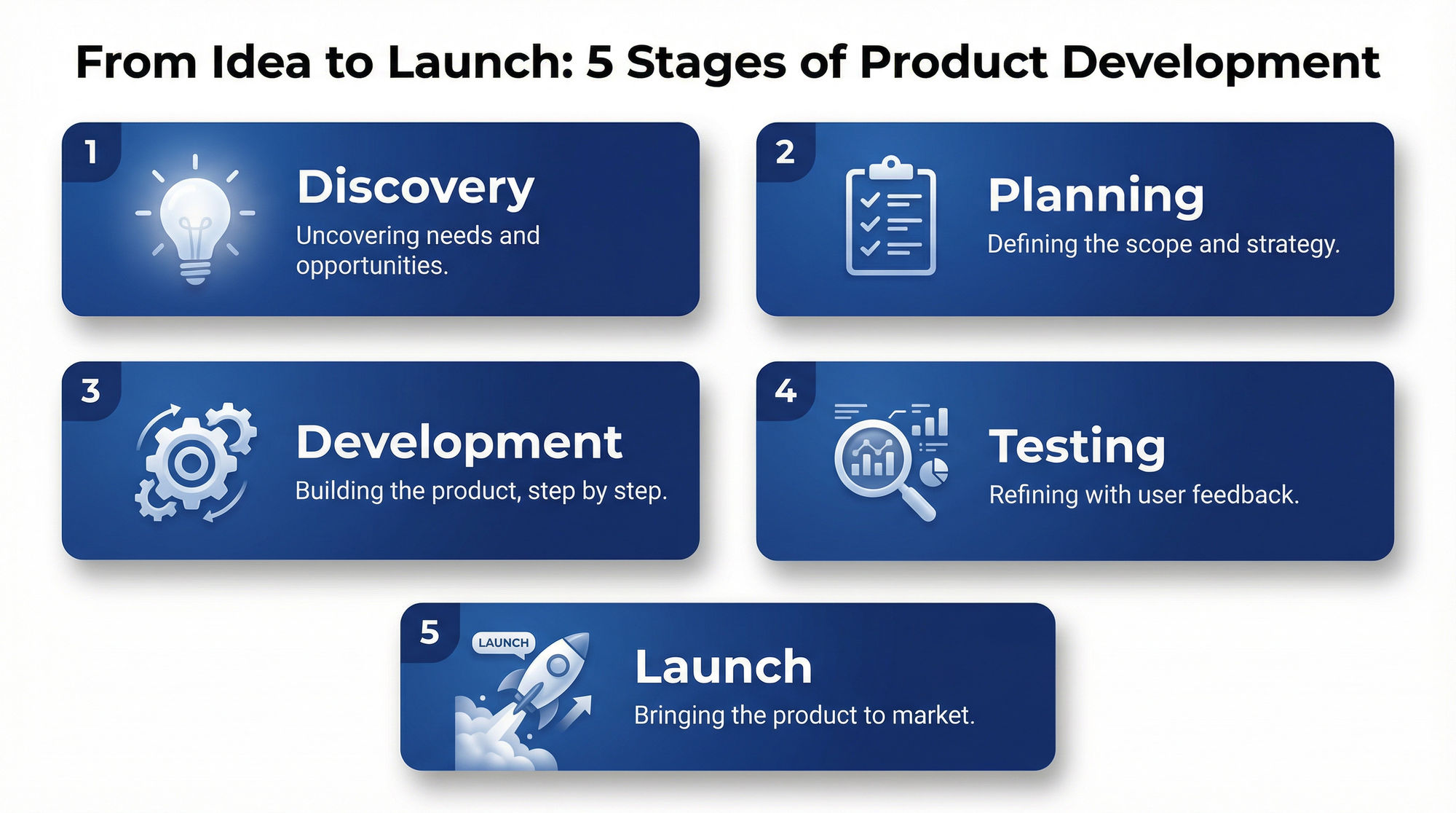
Create a vertical infographic explaining the 5 stages of product development.

Image type: Clean, modern vertical infographic suitable for LinkedIn posts.

Content:
- Headline at top: "From Idea to Launch: 5 Stages of Product Development"
- 5 numbered sections flowing top to bottom:
  1. Discovery (with lightbulb icon)
  2. Planning (with checklist icon)
  3. Development (with gear icon)
  4. Testing (with magnifying glass icon)
  5. Launch (with rocket icon)
- Each section includes a brief 5-7 word description
- Footer with company attribution space

Style:
- Primary color: Deep blue (#1E3A8A)
- Accent color: Bright orange (#F97316)
- Clean white background
- Modern sans-serif typography
- Flat design with subtle drop shadows
- Generous whitespace between sections
- 2:3 aspect ratio
Generation Result
That prompt is 140 words. It might seem long, but every element serves a purpose. I've tested shorter versions, and the results are consistently less usable.
Step 3: Generate and Evaluate
Run your prompt through Nano Banana Pro. I recommend generating 2-3 variations from the same prompt before iterating.
When evaluating outputs, I check these elements in order:
Text accuracy: Are all words spelled correctly? Is punctuation correct? This is usually my biggest concern.
Layout logic: Does information flow in the expected reading order? Are hierarchies clear?
Visual balance: Is the composition pleasing? Is there appropriate whitespace? Are elements aligned?
Brand fit: Does it match the specified style parameters?
For infographics specifically, I've found that Nano Banana Pro nails text accuracy on the first try about 85% of the time. That remaining 15% usually involves either very long text blocks or unusual technical terms.
Step 4: Refine Through Multi-Turn Editing
One of Nano Banana Pro's strongest features is iterative editing. You can have a conversation with the model, making targeted changes to your generated image.
If your first generation is 80% good but has issues, don't regenerate from scratch. Instead, use follow-up prompts:
For text fixes: "Change 'Developement' to 'Development' in section 3"
For color adjustments: "Make the header text darker blue for better contrast"
For layout tweaks: "Increase spacing between sections 2 and 3"
For element changes: "Replace the lightbulb icon with a brain icon in section 1"
In my testing, multi-turn editing in Nano Banana Pro succeeds about 75-80% of the time for targeted changes. The older model (standard Nano Banana) only had about 60% success rate and often made unwanted changes to other parts of the image.
Important limitation: After about 5-7 editing rounds, results start becoming unpredictable. If you need major changes after that point, it's usually faster to regenerate with a refined prompt.
Step 5: Export at the Right Resolution
Nano Banana Pro supports multiple resolution outputs:
Standard (1024×1024 base): Fast generation, suitable for social media and web use. This is what you get on free tiers.
2K resolution: Available on Pro subscription. Better for presentations and high-DPI displays.
4K resolution: Available on Ultra tier and API. Required for print production and large-format displays.
For infographics specifically:
- Social media: Standard resolution is fine
- Blog posts: 2K provides crisp text
- Print/presentation: 4K is worth the extra cost
In the Gemini app, hover over your generated image and click the download button to get the full-resolution file. The preview shown in the chat is compressed and doesn't reflect actual output quality.
12 Infographic Types That Work Exceptionally Well
Through my testing, I've identified specific infographic formats where Nano Banana Pro truly excels. Here are the categories with example prompts you can adapt.
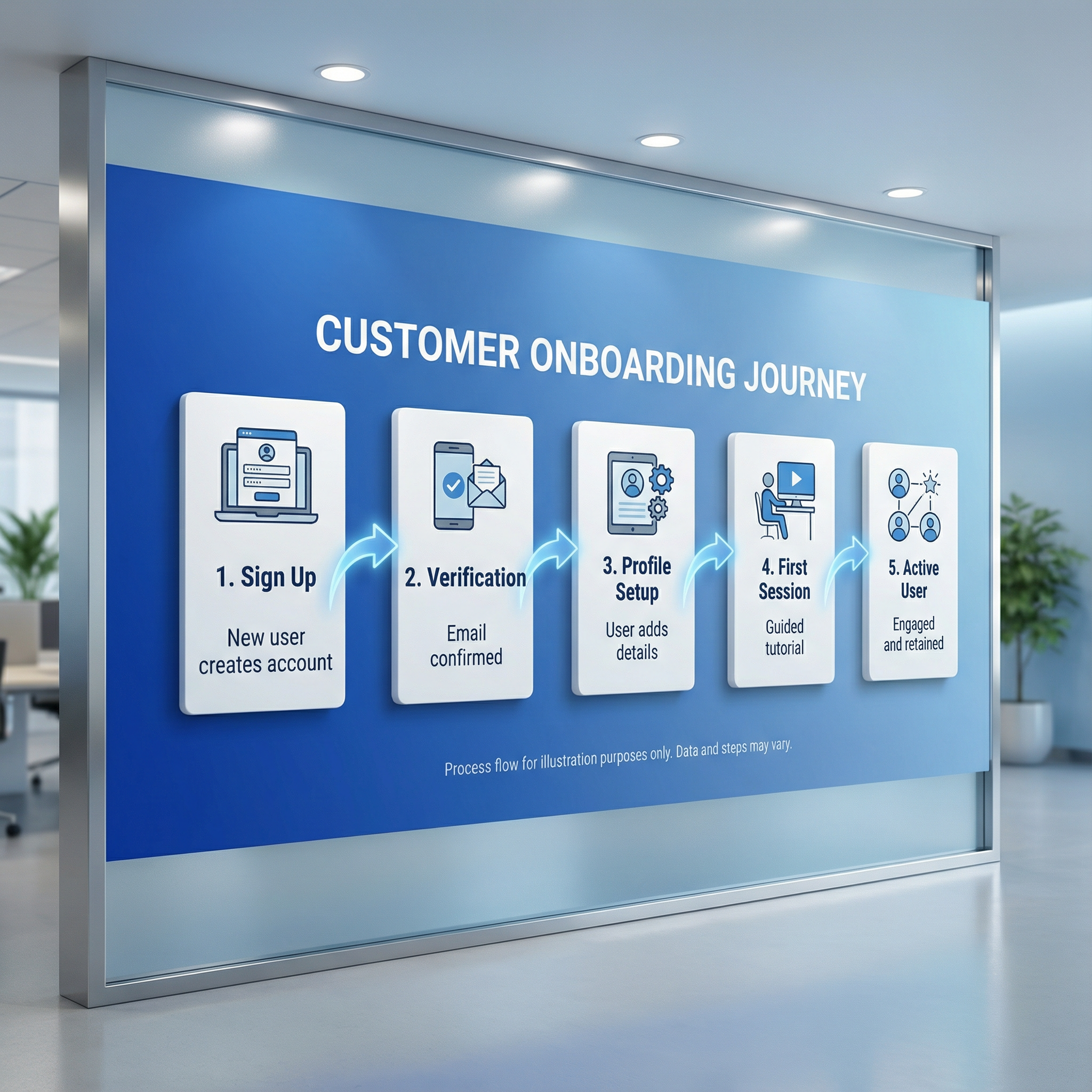
1. Process Flowcharts
Nano Banana Pro understands sequential logic remarkably well.
Example prompt:
Create a horizontal process flowchart showing the customer onboarding journey.

Stages (left to right, connected by arrows):
1. Sign Up - "New user creates account"
2. Verification - "Email confirmed"
3. Profile Setup - "User adds details"
4. First Session - "Guided tutorial"
5. Active User - "Engaged and retained"

Style: Corporate clean, blue gradient background, white cards for each stage, subtle connecting arrows, modern sans-serif, 16:9 aspect ratio
Generation Result
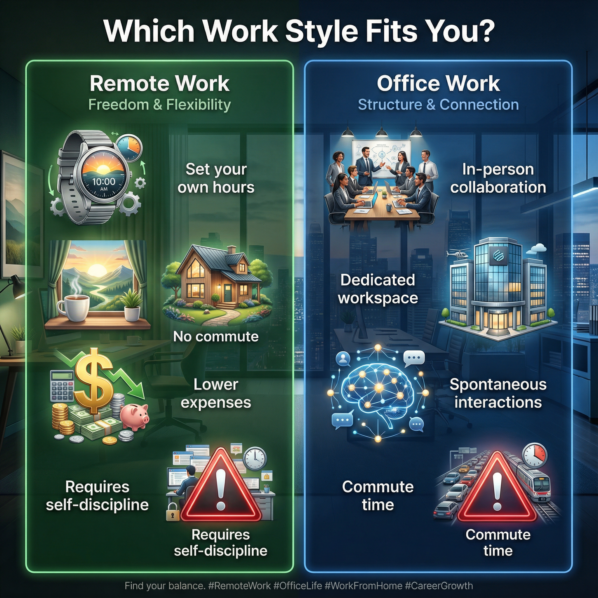
2. Comparison Charts
Side-by-side comparisons leverage the model's ability to maintain visual consistency.
Example prompt:
Create a two-column comparison infographic: "Remote Work vs. Office Work"

Left column (Remote Work):
- Flexibility icon: "Set your own hours"
- Home icon: "No commute"
- Dollar icon: "Lower expenses"
- Warning icon: "Requires self-discipline"

Right column (Office Work):
- Team icon: "In-person collaboration"
- Building icon: "Dedicated workspace"
- Network icon: "Spontaneous interactions"
- Warning icon: "Commute time"

Style: Split design with green left side and blue right side, white text, centered header "Which Work Style Fits You?", clean icons, 4:5 aspect ratio for Instagram
Generation Result
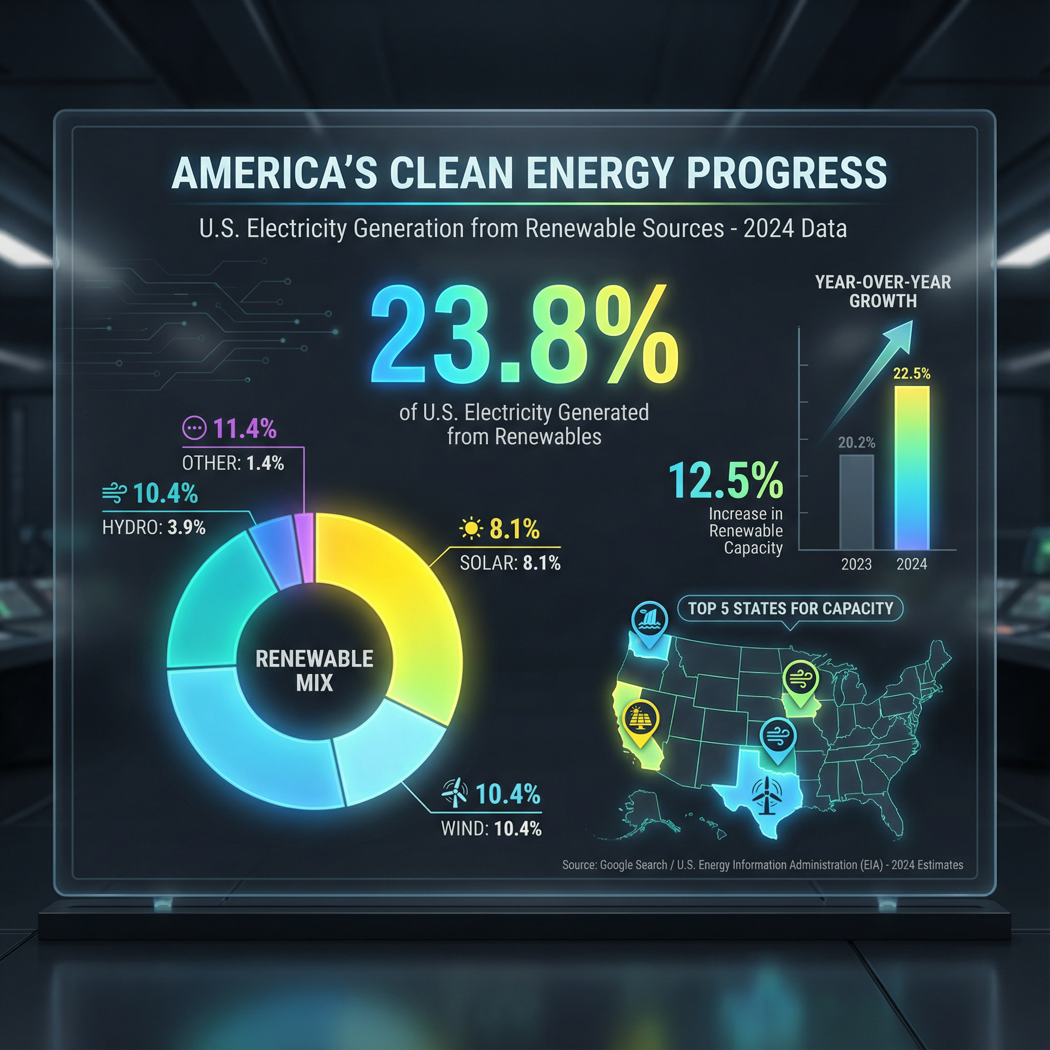
3. Statistical Dashboards
This is where Search Grounding really shines — the model can look up actual data.
Example prompt:
Create an infographic dashboard showing U.S. renewable energy statistics for 2024.

Include:
- Large central number showing percentage of electricity from renewables
- Pie chart breaking down sources (solar, wind, hydro, other)
- Year-over-year growth indicator
- Small map showing top 5 states for renewable capacity

Style: Dark theme (#1F2937 background), bright accent colors for data, clean data visualization style, headline "America's Clean Energy Progress", 16:9 aspect ratio

Note: Use current data from Google Search for accuracy.
Generation Result
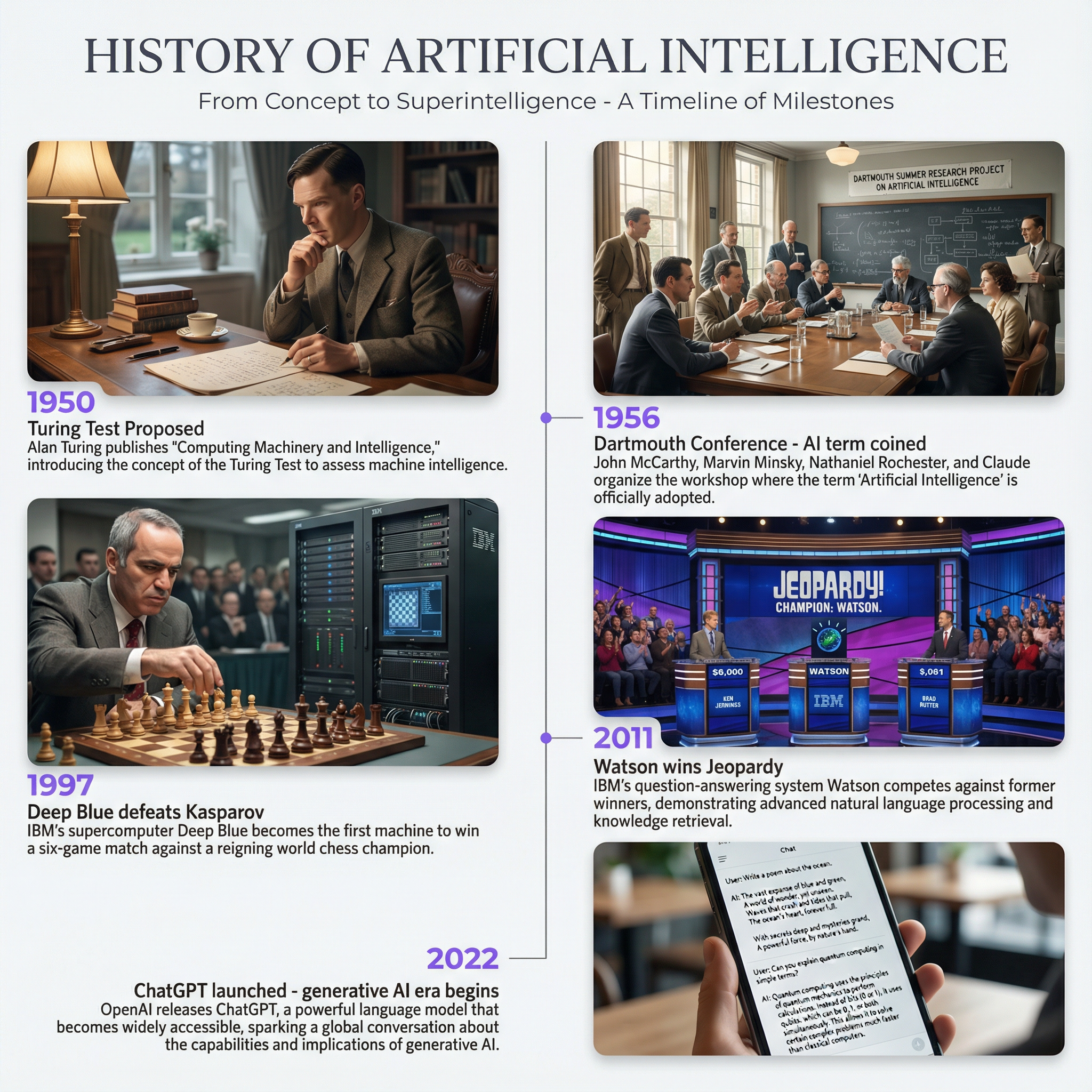
4. Timeline Infographics
Chronological information gets excellent treatment.
Example prompt:
Create a vertical timeline infographic: "History of Artificial Intelligence"

Key milestones (chronological, top to bottom):
- 1950: Turing Test proposed
- 1956: Dartmouth Conference - "AI" term coined
- 1997: Deep Blue defeats Kasparov
- 2011: Watson wins Jeopardy
- 2022: ChatGPT launches
- 2025: Multimodal AI goes mainstream

Style: Minimalist design, single vertical line with alternating left/right entries, dates in accent color (#8B5CF6), brief descriptions in gray text, white background, 9:16 aspect ratio
Generation Result
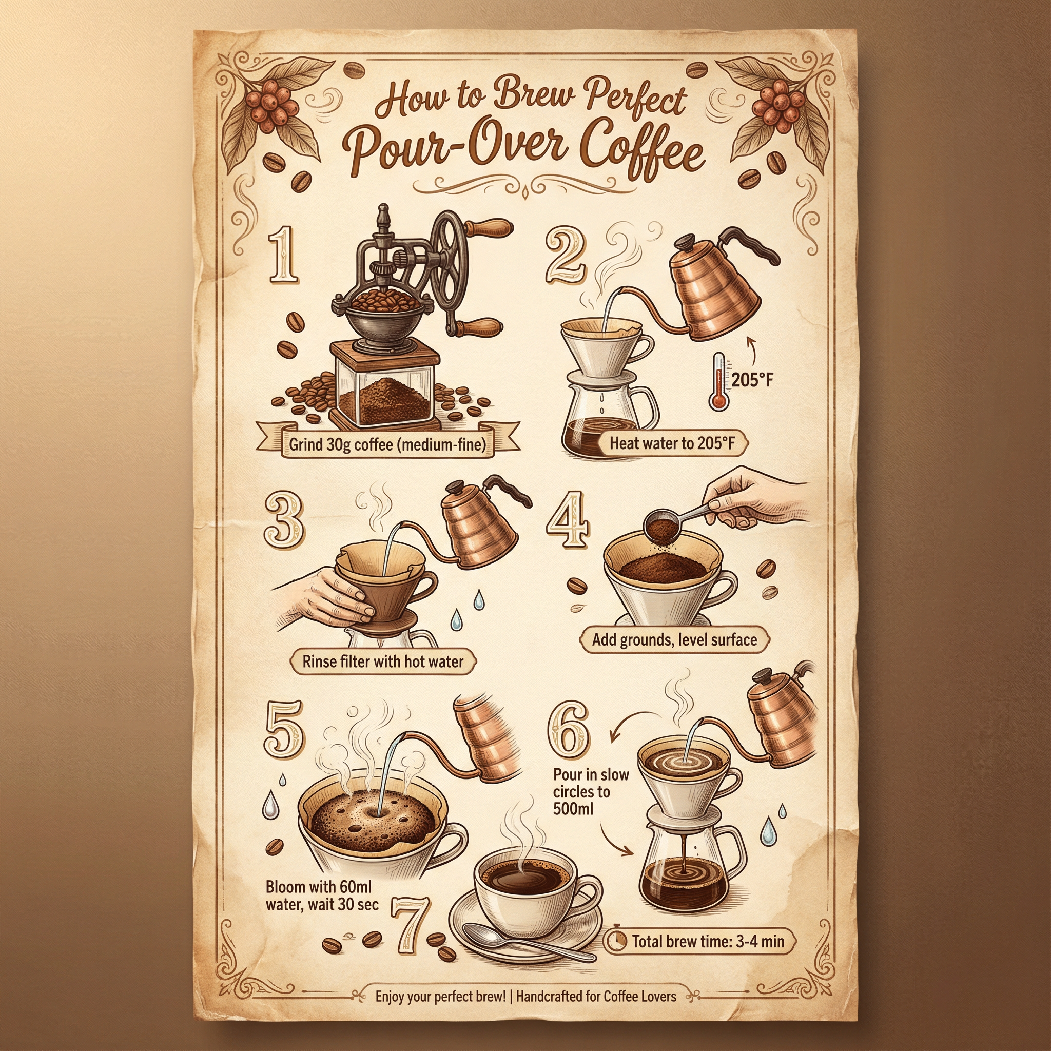
5. How-To Guides
Step-by-step instructions are natural for the model's sequential reasoning.
Example prompt:
Create an instructional infographic: "How to Brew Perfect Pour-Over Coffee"

Steps (numbered, top to bottom):
1. Grind 30g coffee (medium-fine)
2. Heat water to 205°F
3. Rinse filter with hot water
4. Add grounds, level surface
5. Bloom with 60ml water, wait 30 sec
6. Pour in slow circles to 500ml
7. Total brew time: 3-4 minutes

Include small illustration for each step. Style: Warm brown and cream colors, hand-drawn illustration style, recipe-card aesthetic, vertical 2:3 format
Generation Result
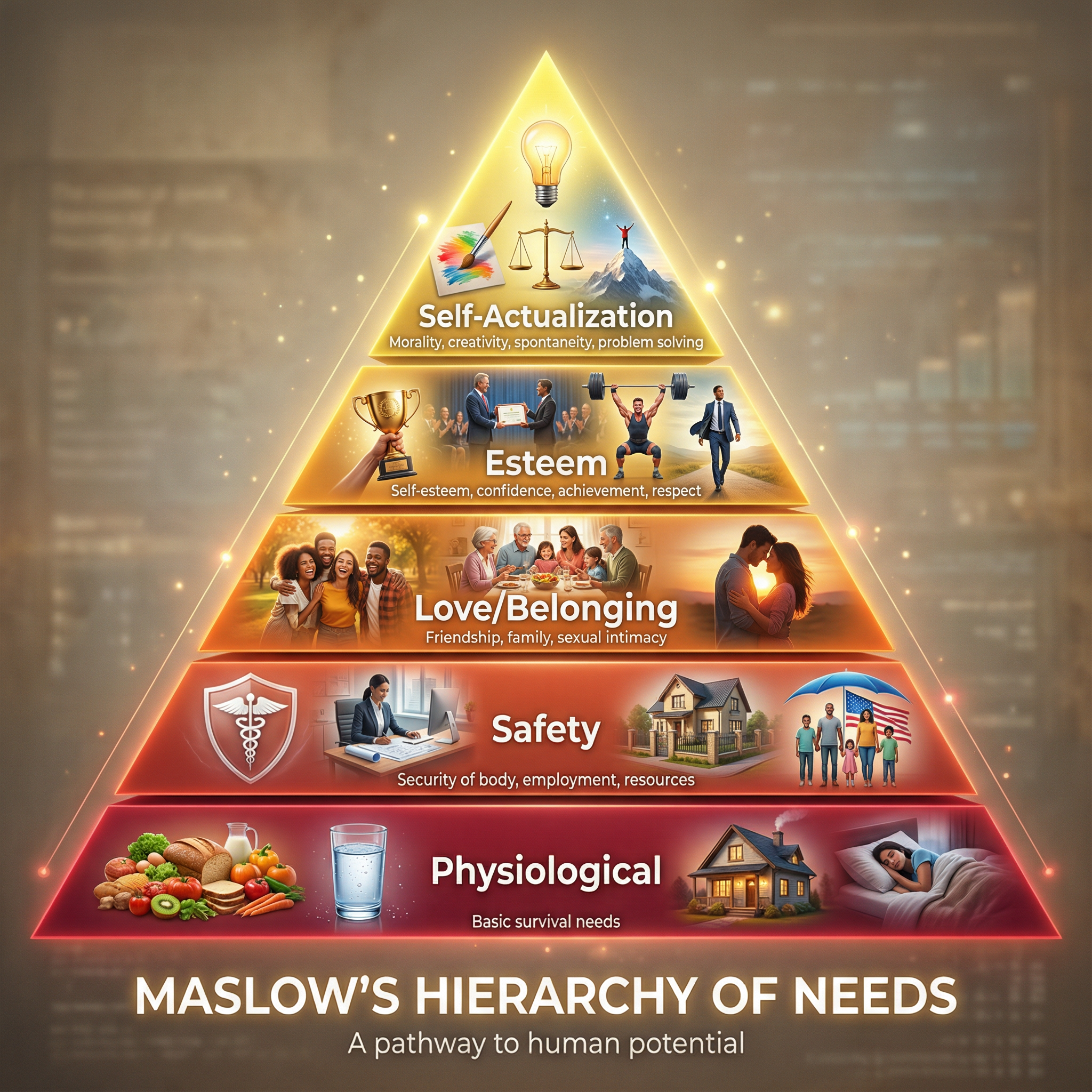
6. Data Pyramids
Hierarchical information works beautifully.
Example prompt:
Create a pyramid infographic: "Maslow's Hierarchy of Needs"

5 layers (bottom to top):
1. Physiological (base, widest): Food, water, shelter, sleep
2. Safety: Health, employment, property, social stability
3. Love/Belonging: Friendship, family, intimacy
4. Esteem: Respect, recognition, strength, freedom
5. Self-Actualization (top, smallest): Creativity, problem solving, morality

Style: Gradient colors from deep red (base) to bright yellow (top), labeled layers with brief text, clean educational style, centered composition, 1:1 aspect ratio
Generation Result
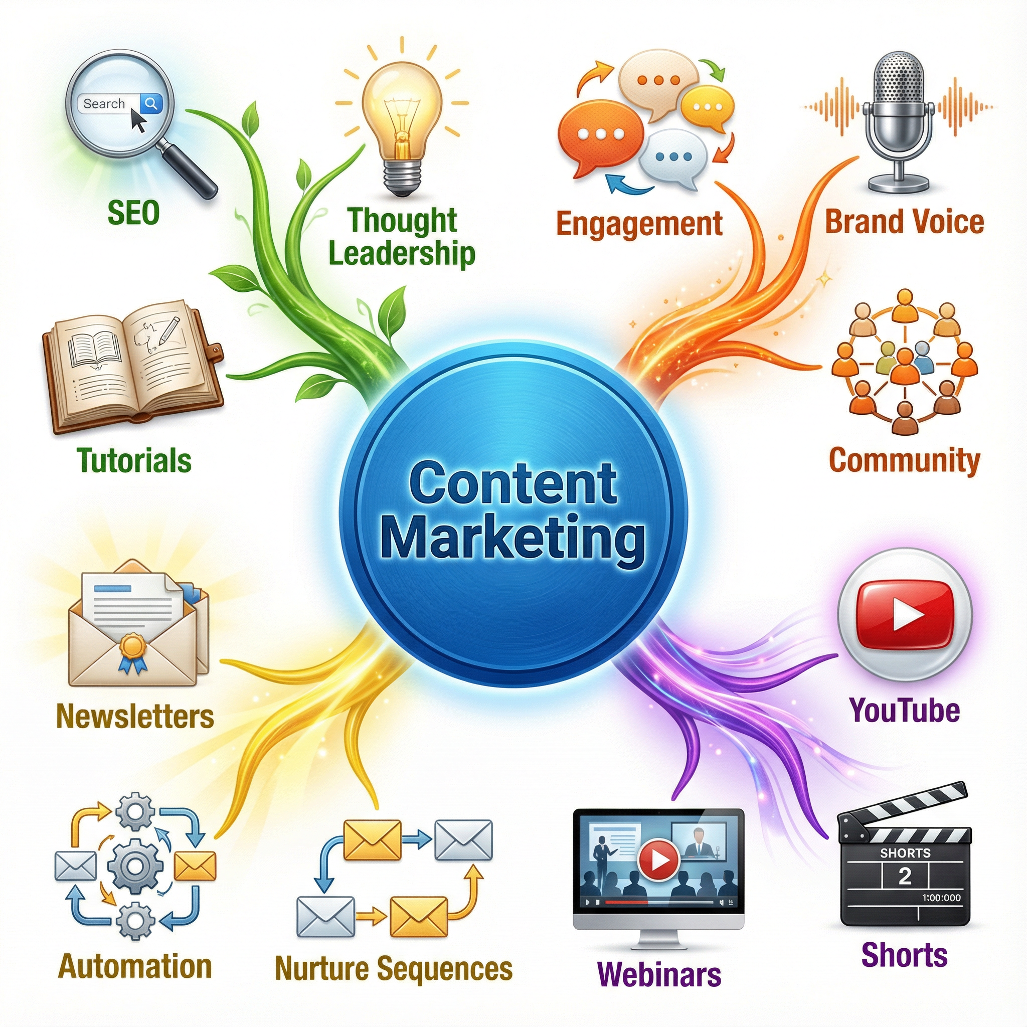
7. Mind Maps
Hub-and-spoke layouts work well with clear central concepts.
Example prompt:
Create a mind map infographic centered on "Content Marketing"

Central hub: "Content Marketing" in large circle
4 main branches radiating outward:
- Blog Posts (sub-items: SEO, thought leadership, tutorials)
- Social Media (sub-items: engagement, brand voice, community)
- Video (sub-items: YouTube, shorts, webinars)
- Email (sub-items: newsletters, automation, nurture sequences)

Style: Colorful but cohesive, each branch a different color, connecting lines curved not straight, playful but professional, white background, 1:1 aspect ratio
Generation Result
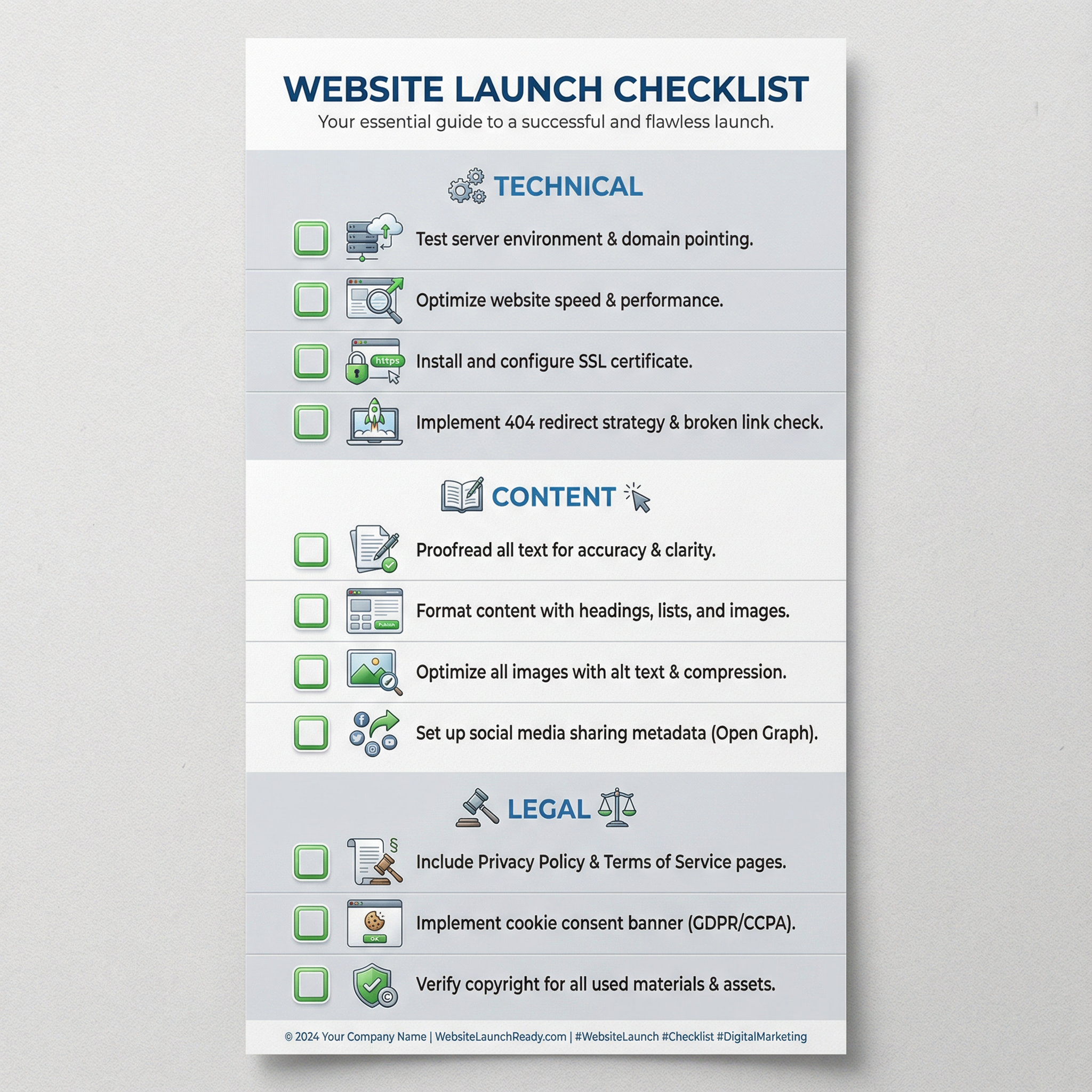
8. Checklist Infographics
Perfect for actionable content — checkboxes render cleanly.
Example prompt:
Create a checklist infographic: "Website Launch Checklist"

Sections with checkboxes:
Technical:
□ SSL certificate installed
□ Mobile responsiveness tested
□ Page speed optimized
□ 404 page created

Content:
□ All copy proofread
□ Images optimized
□ Meta descriptions written
□ CTAs tested

Legal:
□ Privacy policy published
□ Terms of service linked
□ Cookie consent added

Style: Clean corporate design, sections in alternating light gray and white, green checkbox accent color, header at top, 9:16 vertical format for Pinterest
Generation Result
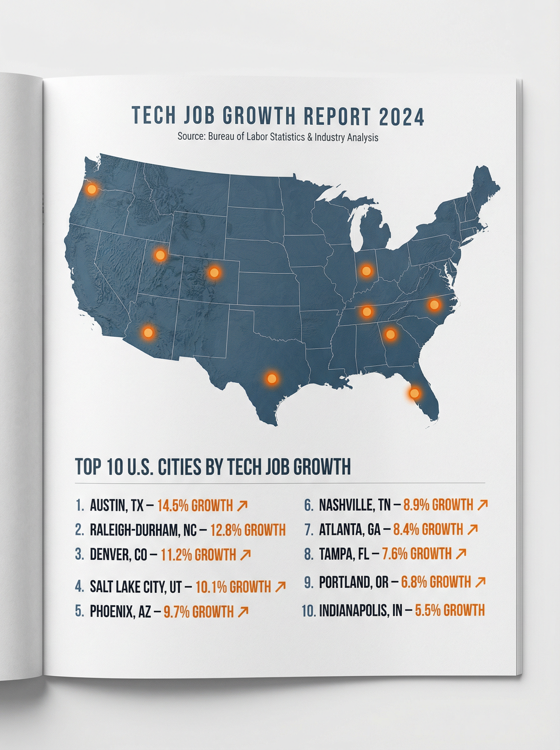
9. Geographic Infographics
Maps and location-based data leverage Search Grounding.
Example prompt:
Create a geographic infographic showing "Top 10 U.S. Cities by Tech Job Growth 2024"

Include:
- Simple U.S. map with highlighted cities
- Numbered list with city names and growth percentages
- Visual indicators (icons or dots) on map locations
- Brief header explaining the data source

Style: Professional business publication style, muted blue map, accent dots in orange, clean typography, white background, 16:9 landscape
Generation Result
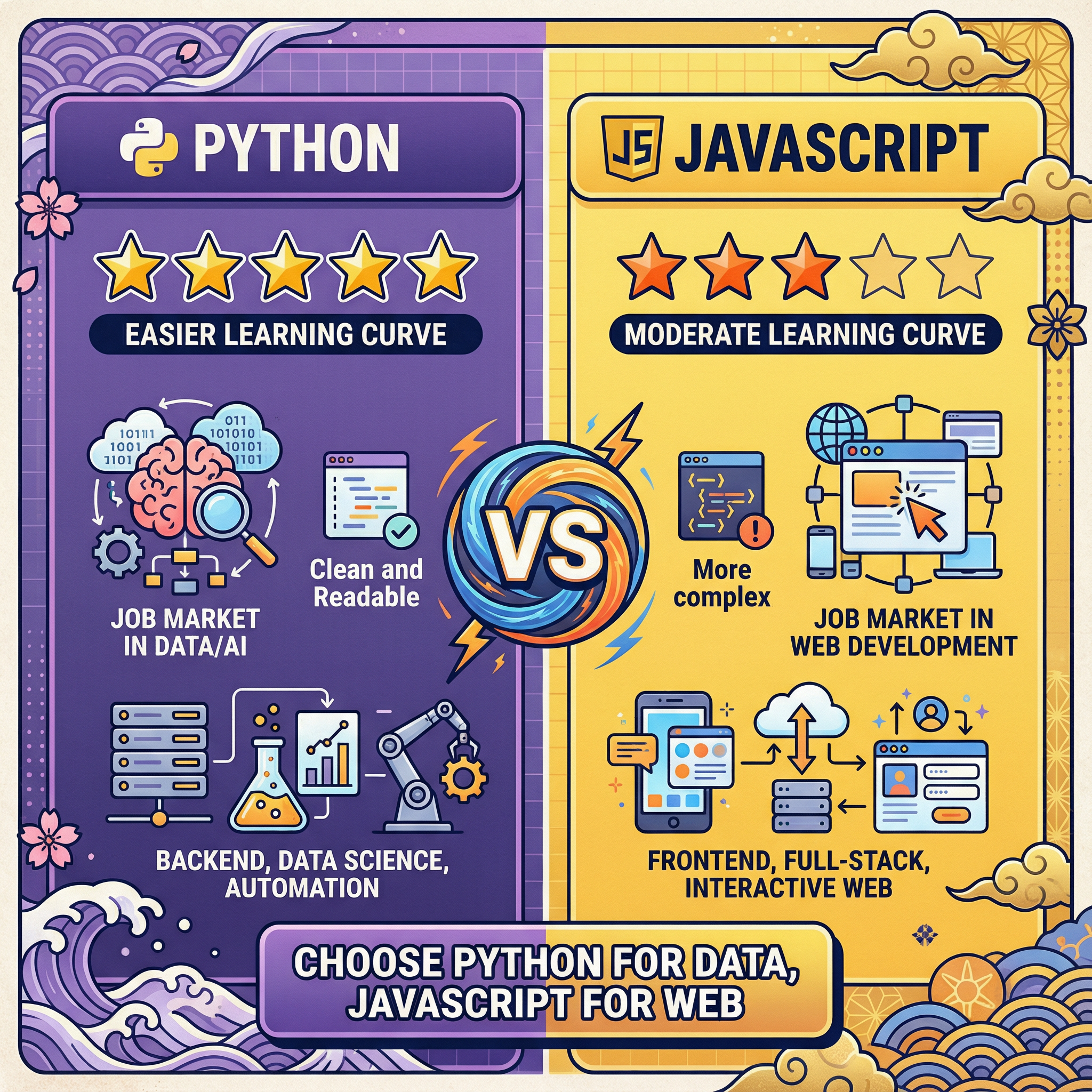
10. Versus/Battle Cards
Head-to-head comparisons with clear winners.
Example prompt:
Create a versus infographic: "Python vs JavaScript for Beginners"

Left side (Python):
- Learning curve: Easier ★★★★★
- Job market: Data/AI focused
- Syntax: Clean and readable
- Best for: Backend, data science, automation

Right side (JavaScript):
- Learning curve: Moderate ★★★☆☆
- Job market: Web development
- Syntax: More complex
- Best for: Frontend, full-stack, interactive web

Center divider with "VS" badge. Bottom verdict section: "Choose Python for data, JavaScript for web"

Style: Split design, purple left (Python) and yellow right (JavaScript), dark text, gaming/esports aesthetic, 1:1 aspect ratio
Generation Result
Advanced Prompting Techniques for Professional Results
Once you've mastered the basics, these advanced techniques will elevate your infographic quality further.
Technique 1: Negative Prompting
Tell the model what you don't want. This is especially useful for avoiding common AI art aesthetics.
Add to your prompts:
Avoid: photorealistic elements, 3D renders, busy backgrounds, decorative borders, stock photo style, cluttered composition, tiny unreadable text
Technique 2: Reference Explicit Text Limits
For critical text accuracy, specify that text should be minimal.
Keep all text elements under 10 words each. Use icons and visuals to communicate concepts rather than lengthy descriptions.
Technique 3: Specify Hierarchy Explicitly
Don't assume the model will figure out visual hierarchy.
Visual hierarchy (largest to smallest):
1. Main headline: 48pt equivalent
2. Section headers: 24pt equivalent
3. Body text: 14pt equivalent
4. Labels/captions: 10pt equivalent
Technique 4: Use Color Hex Codes
Rather than saying "blue," specify exactly what you mean.
Color palette:
- Primary: #2563EB (royal blue)
- Secondary: #64748B (slate gray)
- Accent: #F59E0B (amber)
- Background: #FFFFFF (white)
- Text: #1F2937 (near-black)
Technique 5: Request Consistency Anchors
If you're creating a series, describe anchoring elements.
Maintain series consistency:
- Header bar: 80px height, primary color, centered white title
- Footer: Company logo left, page number right
- Margins: 40px all sides
- Section dividers: 2px horizontal lines in secondary color
Technique 6: Multi-Turn Style Lock
After generating an image you like, use follow-up prompts to lock the style.
I love this style. For my next generation, maintain this exact visual treatment: the color palette, illustration style, typography choices, and layout approach. Only change the content.
The Limitations You Need to Know (From Real Testing)
I promised honest coverage of limitations. Here's what I've encountered.
Limitation 1: Long-Form Text Remains Unreliable
While short headlines are nearly perfect, paragraphs over 30 words will likely have errors. My recommendation: design infographics around short, punchy text. If you need paragraphs, plan to add them in Canva or Photoshop afterward.
Limitation 2: Precise Data Visualization Is Hit-or-Miss
Bar charts with specific values sometimes get proportions wrong. A bar that should be twice as tall as another might only be 1.5x. For data-critical visualizations, use Nano Banana Pro for the design framework, then recreate exact charts in Excel or a charting tool.
Limitation 3: Generation Speed Is Slower Than Competitors
Nano Banana Pro takes 8-12 seconds per generation versus 3-4 seconds for standard Nano Banana or similar tools. The quality is worth it, but don't expect rapid iteration.
Limitation 4: Free Tier Is Essentially a Demo
With only 2-3 generations per day for free users, you can't realistically produce professional work on the free tier. It's useful for testing, not production.
Limitation 5: Character Consistency Across Multiple Images
If you're creating a series with illustrated characters, faces and features may drift between generations. This is improved from older models but not eliminated.
Limitation 6: Complex Prompts Can Confuse the Model
I've found a practical ceiling around 200-250 words per prompt. Beyond that, the model starts dropping instructions. Break complex infographics into sections if needed.
Limitation 7: Multi-Character Scenes Get Crowded
Scenes with more than 5-6 distinct elements (icons, text blocks, characters) sometimes have placement issues. Simplify or generate in stages.
Limitation 8: Watermarks on Free/Pro Tiers
Free and Pro tiers include a visible "Gemini" watermark in the corner. Only Ultra tier and API access remove visible watermarks (invisible SynthID watermarks remain on all outputs for AI content verification).
My Actual Production Workflow
Let me share exactly how I use Nano Banana Pro in my real client work.
Phase 1: Concept Development (Not in AI)
I sketch the infographic structure by hand or in a notes app. I determine:
- Key message and supporting points
- Logical flow and hierarchy
- Rough layout (vertical? horizontal? sections?)
- Text content (written out exactly)
This takes 15-30 minutes and prevents wasted generations.
Phase 2: Style Exploration (3-5 generations)
I run prompts to explore visual directions, focusing on style rather than content accuracy. I might generate variations with:
- Different color palettes
- Various illustration styles
- Alternative layouts
Goal: Find a visual direction that works.
Phase 3: Content Refinement (5-10 generations)
Once I have a style direction, I refine the prompt for content accuracy. This phase focuses on:
- Getting all text correct
- Proper information hierarchy
- Correct number of sections/elements
I use multi-turn editing here to fix small issues rather than regenerating.
Phase 4: Final Polish (In Canva/Photoshop)
Even excellent AI outputs usually need minor tweaks:
- Replacing any text with errors
- Adjusting colors to exact brand specs
- Adding client logos
- Ensuring print-ready resolution
This typically takes 10-20 minutes — a fraction of creating from scratch.
Phase 5: Export and Format
I export from Nano Banana Pro at the highest available resolution, then resize/reformat in my design tool for different platforms.
Total time for a professional infographic: 45-90 minutes
Compare to traditional approach: 3-6 hours minimum
That's the real productivity gain. Not that AI replaces the creative process, but that it accelerates the production phase dramatically.
Integrations That Multiply Your Productivity
Nano Banana Pro doesn't exist in isolation. Here's how it fits into a broader workflow.
Google Slides Integration
If you're a Google Workspace user, Nano Banana Pro is directly available in Google Slides through the "Help me visualize" feature. You can prompt for infographics directly within your presentation.
Practical use: Generate an infographic concept in Gemini, then refine it directly in Slides for presentation use.
NotebookLM Integration
Google's NotebookLM can now generate infographics from your uploaded documents. Upload a report, and ask it to "create an infographic summarizing the key findings." This is powerful for researchers, analysts, and consultants who need to visualize existing content.
Vertex AI for Production Pipelines
If you're building tools or need programmatic access, Vertex AI provides enterprise-grade API access with provisioned throughput. This is how agencies and SaaS products integrate Nano Banana Pro at scale.
Third-Party Platforms
Several platforms have integrated Nano Banana Pro:
- ImagineArt offers Nano Banana Pro with 100 free credits
- Various "Nano Banana" wrapper sites provide alternative interfaces
These can be useful if Google's official services are congested or if you want different UX.
Common Mistakes (And How I Learned From Them)
Let me share the errors I made early on so you can avoid them.
Mistake 1: Prompts Too Vague
Bad: "Create an infographic about climate change"
Specific prompts yield specific results.
Mistake 2: Too Much Text in Single Elements
Bad: Asking for a paragraph of 50+ words in one text block
The model handles many short text blocks better than few long ones.
Mistake 3: Ignoring Aspect Ratio
Bad: Not specifying dimensions, then getting unusable proportions
This is especially critical if you're designing for specific platforms.
Mistake 4: Expecting Perfect First Outputs
Bad: Regenerating from scratch after every imperfect result
The editing capability is one of Nano Banana Pro's strongest features. Use it.
Mistake 5: Not Verifying Data
Bad: Trusting Search Grounding to be 100% accurate
Search Grounding reduces hallucinations but doesn't eliminate them.
Sample Prompts You Can Use Today
Here are copy-paste ready prompts for common infographic types:
Marketing Performance Dashboard
Create a marketing dashboard infographic showing key performance metrics.

Layout: 2x2 grid with large central KPI

Elements:
- Central large number: "127% ROI" with upward arrow
- Top left card: Website Traffic (icon: graph trending up) "45K monthly visitors"
- Top right card: Conversion Rate (icon: funnel) "3.2%"
- Bottom left card: Email Open Rate (icon: envelope) "28%"
- Bottom right card: Social Engagement (icon: heart) "12K interactions"

Header: "Q4 2024 Marketing Performance"
Footer: "Data period: Oct-Dec 2024"

Style: Dark theme (#111827 background), bright accent cards (blue, green, purple, orange), white text, clean data visualization style, 16:9 aspect ratio
Generation Result
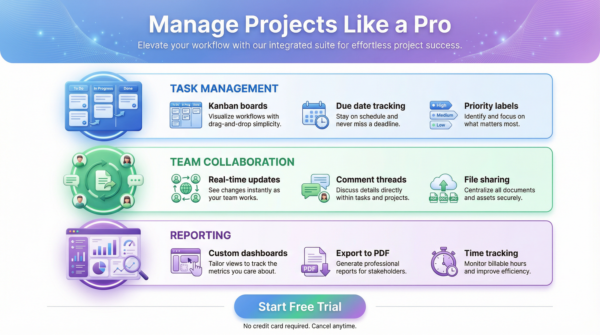
Product Feature Overview
Create a product feature infographic for a project management app.

Headline: "Manage Projects Like a Pro"

3 main feature sections (horizontal layout):

1. Task Management (blue icon)
   - "Kanban boards"
   - "Due date tracking"
   - "Priority labels"

2. Team Collaboration (green icon)
   - "Real-time updates"
   - "Comment threads"
   - "File sharing"

3. Reporting (purple icon)
   - "Custom dashboards"
   - "Export to PDF"
   - "Time tracking"

Bottom CTA: "Start Free Trial"

Style: SaaS marketing aesthetic, gradient hero section at top, white background, colorful icons, modern sans-serif, 4:5 aspect ratio
Generation Result
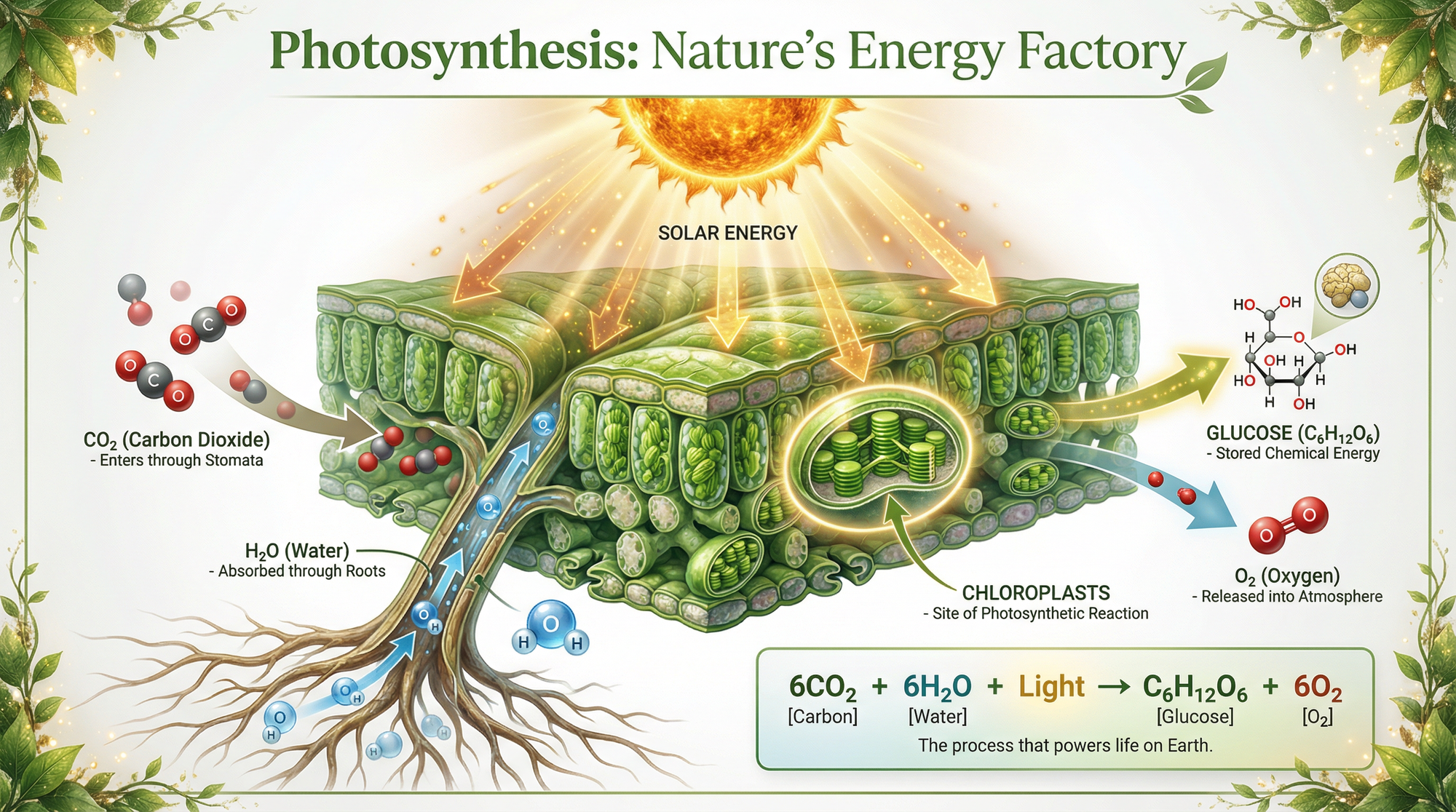
Educational Explainer
Create an educational infographic: "How Photosynthesis Works"

Visual flow (top to bottom):

1. Sun icon with arrows showing light energy
2. Leaf cross-section illustration showing:
   - CO2 entering through stomata (labeled)
   - H2O absorbed through roots (labeled)
   - Chloroplasts where reaction occurs (labeled)
3. Output arrows showing:
   - Glucose (stored energy)
   - O2 released

Simple equation box: 6CO2 + 6H2O + Light → C6H12O6 + 6O2

Header: "Photosynthesis: Nature's Energy Factory"

Style: Scientific illustration style, natural green color palette, educational diagram aesthetic, labeled components with leader lines, white background, 2:3 vertical aspect ratio
Generation Result
Frequently Asked Questions
How does Nano Banana Pro compare to Canva's AI tools?
Canva's Magic Design is excellent for templated content but less flexible for custom infographics. Nano Banana Pro creates from scratch with more creative control but requires more prompt engineering skill. I use both: Nano Banana Pro for initial concept generation, Canva for refinement and brand asset integration.
Can I use Nano Banana Pro outputs commercially?
Yes, images created with Nano Banana Pro are licensed for commercial use including marketing, advertising, and client work. However, don't request copyrighted characters, trademarked logos, or proprietary designs. All outputs include SynthID watermarks identifying them as AI-generated.
What's the best aspect ratio for LinkedIn infographics?
For LinkedIn feed posts, 1:1 or 4:5 works best for visibility in the feed. For LinkedIn articles or document shares, 16:9 or letter (8.5:11) proportions work well.
How do I get consistent branding across multiple infographics?
Include explicit brand parameters in every prompt: hex color codes, font style descriptions, and layout anchors. Alternatively, generate one infographic you love, then reference it in subsequent prompts: "Match the visual style of the previous generation."
Does Nano Banana Pro work in languages other than English?
Yes, Gemini 3's multilingual capabilities extend to text rendering. You can generate infographics in multiple languages with accurate text. Quality is highest in major world languages; less common languages may have more errors.
What file format does Nano Banana Pro output?
PNG by default at various resolutions depending on your tier. For print work, you may need to convert to PDF or other formats in your design tool.
Final Thoughts: Is Nano Banana Pro Worth It for Infographics?
After nearly 50 hours of testing and several weeks of production use, here's my honest assessment:
Nano Banana Pro is the best AI tool currently available for creating infographics with accurate text. The text rendering is genuinely revolutionary compared to every other AI image generator I've used. The Search Grounding feature adds factual reliability that's impossible with other tools.
But it's not magic. You need to invest time learning effective prompting. You need to verify outputs. You'll still need design tools for final polish on professional work.
The productivity gain is real. What used to take me 4-6 hours now takes 60-90 minutes. That's not because the AI does all the work — it's because the AI does the tedious production work while I focus on creative and strategic decisions.
The economics make sense for professionals. The $19.99/month Pro subscription pays for itself if you create even one infographic per week professionally. The time savings justify the cost.
For hobbyists and learners, the free tier is limited but educational. You can absolutely learn the system and create occasional infographics on the free tier. You just can't do high-volume production.
My recommendation: If infographics are part of your professional work, invest in learning Nano Banana Pro now. The tool is only going to get better, and the skills you build will transfer to future improvements.
Start with the prompts in this guide. Experiment. Make mistakes. Learn what works for your specific use cases.
The future of visual content creation is here. It's not about AI replacing designers — it's about AI amplifying what designers can accomplish.
Related Articles