
In the modern design ecosystem, Figma has cemented its role as the central hub for UI/UX designers, product teams, and developers working across platforms. But with growing product complexity, scaling consistency across multiple digital experiences isn’t just about good design—it’s about robust systems.
That’s where design system frameworks in Figma come into play. These structured, modular approaches help teams move beyond component libraries into scalable ecosystems. Whether you’re a solo designer or part of a cross-functional enterprise team, the right design system framework can transform how you work, collaborate, and prototype.
This article explores the most convenient and high-functionality frameworks for building design systems in Figma, updated for 2025. The focus here isn’t just on aesthetic templates—but on real functionality: reusable components, documentation integration, developer handoff, accessibility standards, and AI-powered automation.
Why Figma Remains the Foundation for Design Systems
Figma has evolved far beyond a UI design tool. It’s now an end-to-end product design platform, thanks to features like real-time collaboration, powerful component nesting, Auto Layout, interactive prototypes, and Figma Tokens.
What makes Figma especially effective for design systems is its component architecture and integration capabilities. But without a thoughtful framework, even Figma's power can become unwieldy. That’s why ready-made or customizable design system frameworks are so critical—they let teams focus on innovation rather than reinventing the wheel.
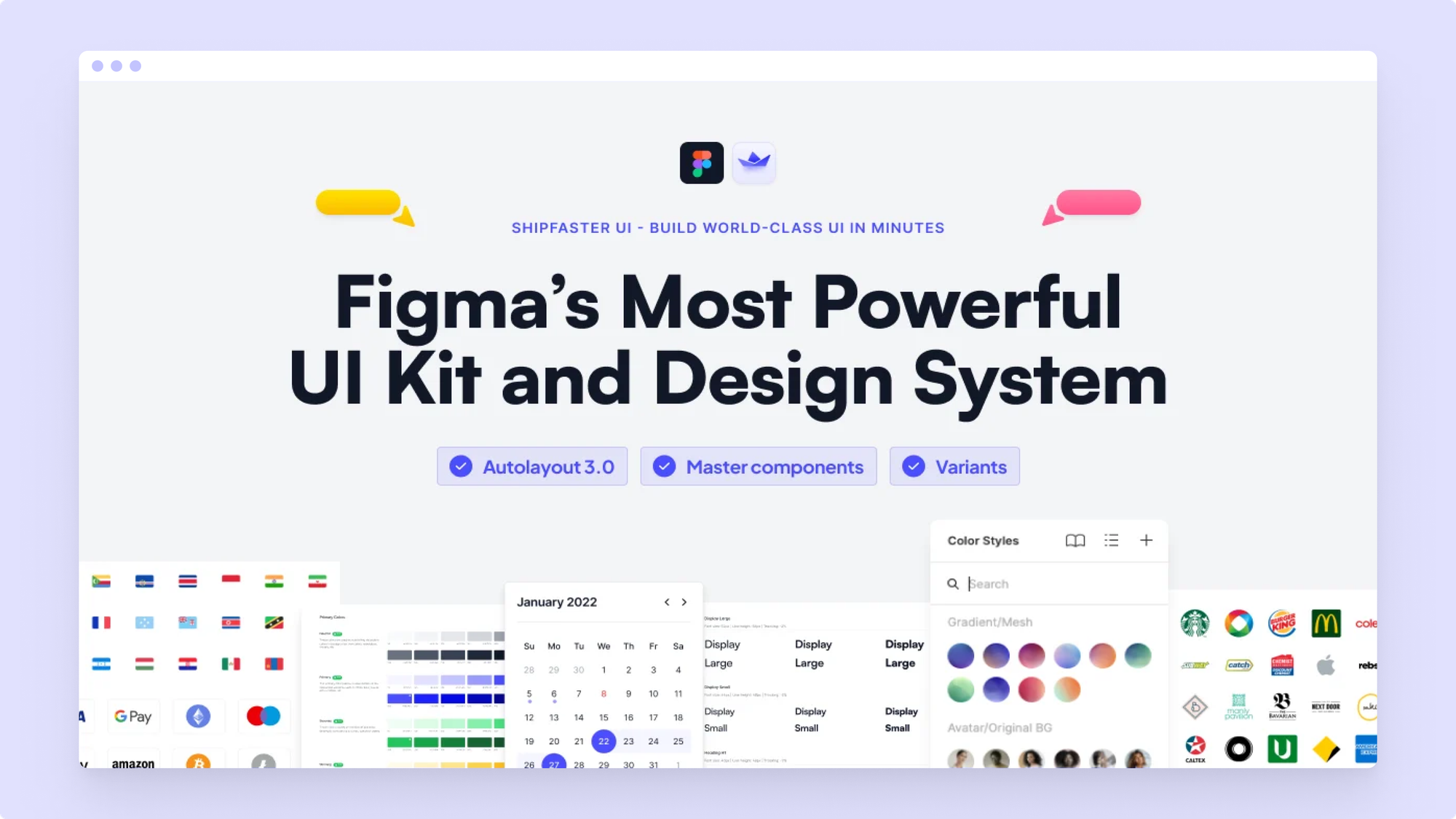
1. Untitled UI Design System
Untitled UI is one of the most well-known premium design systems for Figma—and for good reason. It strikes an ideal balance between aesthetics and scalability, making it a popular choice for startups, agencies, and even enterprise teams.
What sets Untitled UI apart is its level of completeness. It’s more than a set of buttons and inputs; it comes with responsive grids, advanced components, and even marketing-specific elements like pricing tables and dashboards.
Why It’s Convenient:
- Well-organized with clear naming conventions.
- Built on Auto Layout 4.0 with logical spacing and responsive rules.
- Deep integration with Figma Tokens and variables for theming.
- Ready for AI tools like Diagram and Magician to plug in without friction.
For teams looking to launch a full-scale design system in weeks rather than months, Untitled UI is a no-brainer.
2. Eva Design System (by Akveo)
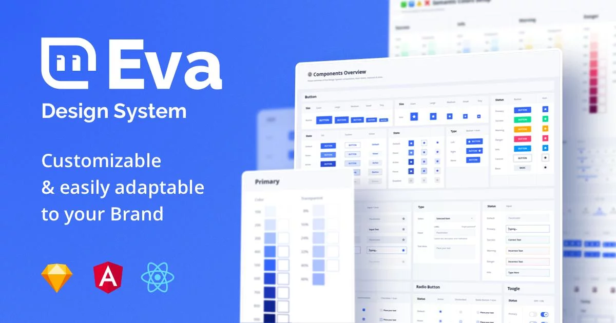
Originally created for enterprise app design and Angular integrations, the Eva Design System is now optimized for broader use cases. Its Atomic Design-based architecture makes it especially suitable for product design teams that prioritize logic and structure.
The Figma kit includes components mapped directly to their React Native and Angular equivalents, which means devs love it just as much as designers do.
Why It’s Convenient:
- Tokenized styles for spacing, color, and typography.
- Integration-ready with Storybook and popular UI frameworks.
- Accessibility considerations baked into components.
- Compatible with Tokens Studio for automatic code export.
3. Cabana Design System
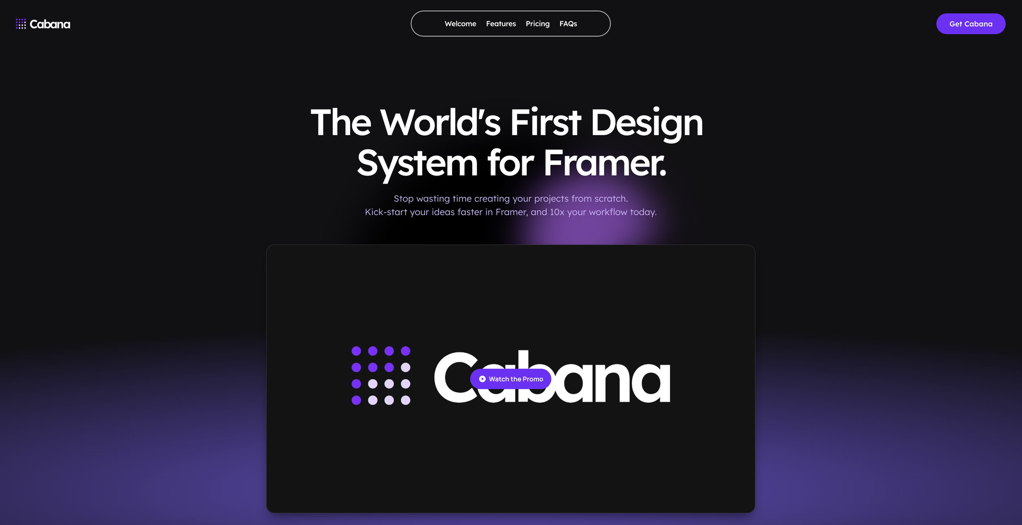
Cabana is tailored toward designers building web-first products, with a special focus on e-commerce and SaaS. It’s ideal for teams looking for a no-code, low-setup design system that still adheres to best practices.
In its latest version, Cabana has embraced Figma’s advanced variables, local styles, and real-time collaboration features, allowing teams to implement light/dark modes and brand variants effortlessly.
Why It’s Convenient:
- Lightweight and fast, even with dozens of pages.
- Modular enough for rapid prototyping and MVPs.
- Comes with built-in documentation templates in Figma itself.
- Intuitive even for non-technical designers or marketers.
4. Backlight’s Design Tokens + Figma Integration
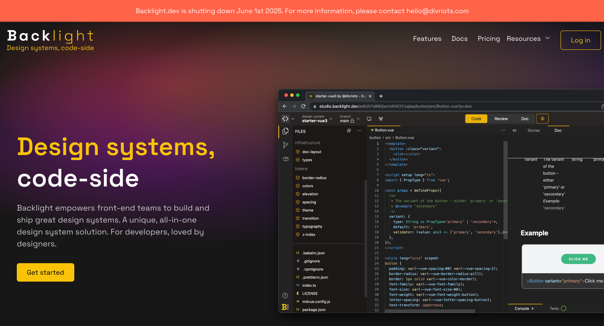
Though not a traditional framework in itself, Backlight.dev introduces a unique take by bridging Figma with developer-first workflows via design tokens. By syncing tokens from JSON or GitHub repos, teams can ensure UI consistency across Figma, React, Vue, or native apps.
This kind of token-first thinking is essential for scalability and is becoming the new standard in systems thinking.
What makes Backlight especially convenient is that you don’t need to rebuild your Figma components—you can connect tokens directly, track changes, and sync updates to your codebase.
Why It’s Convenient:
- Real-time bidirectional token syncing.
- Works with any Figma library—no need to rebuild.
- Enables automation for themes, responsiveness, and component states.
- Essential for AI-driven interface generation pipelines.
5. Design System Framework by Designership
This newer entry has quickly gained traction, especially in design bootcamps and product startups. Created by UX designer Michael Wong, Designership’s system is packed with highly reusable, Auto Layout-driven components and a deep focus on accessibility and grid logic.
The 2025 version includes complete onboarding flows, advanced component variants, and token support out of the box.
Why It’s Convenient:
- Built to teach and scale—perfect for junior and senior designers alike.
- Systemic structure supports both app UI and web layouts.
- Works seamlessly with Figma plugins like Similayer and Batch Styler.
- Now includes native support for Figma’s new "Component Properties" and conditional logic.
6. Prime Design System by Prime Design Co

The Prime Design System is known for being a design tool made by designers for designers. With meticulously built Auto Layout components, modularity, and seamless responsiveness, it fits perfectly into product teams that want pixel-perfect consistency without sacrificing speed.
This system is also highly customizable, making it ideal for brands that want full control over aesthetics while relying on strong foundational logic.
Why It’s Convenient:
- Component-centric structure with consistent token implementation.
- High accessibility standards and dark/light mode support.
- Regular updates and lifetime access.
- Built-in variants and states for complex flows.
7. BRIX Design System
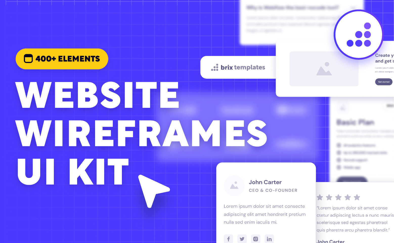
Developed by the team at BRIX Agency, this framework is perfect for teams working on marketing websites, landing pages, and SaaS interfaces. Unlike product-heavy frameworks, BRIX is optimized for storytelling and performance marketing, making it popular among growth teams.
It includes ready-to-use content blocks, banners, CTAs, hero sections, and even charts, all aligned under a clean, modern aesthetic.
Why It’s Convenient:
- Predefined content modules for rapid marketing site creation.
- Figma and Webflow compatibility.
- Color variables and typography tokens pre-set.
- UX patterns aligned with conversion best practices.
8. Flowbite Design System for Tailwind
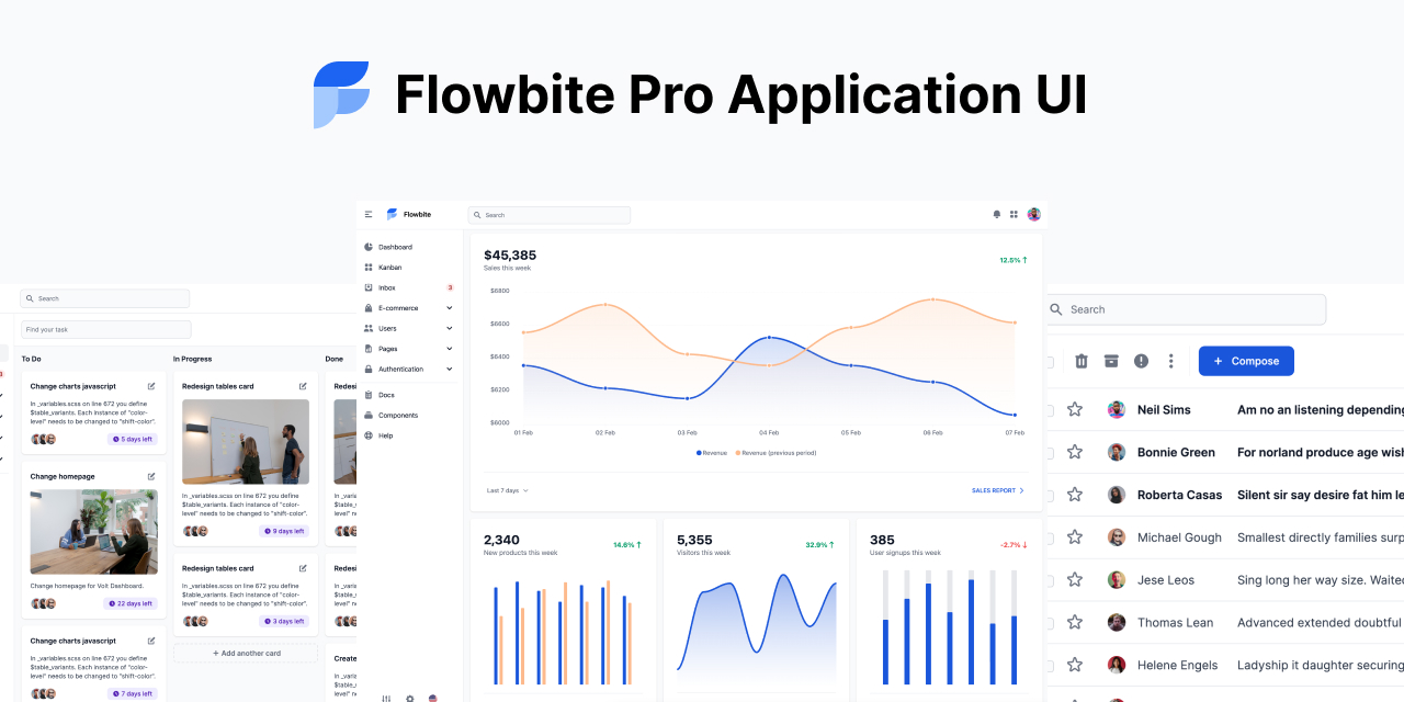
Flowbite combines the utility-first design approach of Tailwind CSS with a complete Figma UI kit. It’s extremely developer-friendly, especially if your front-end stack is already based on Tailwind. The components are mapped to real code counterparts, making handoffs seamless.
It’s a fantastic choice for dev-heavy teams building internal tools or admin panels.
Why It’s Convenient:
- 500+ prebuilt UI components with Tailwind classes in mind.
- Grid-based design with Tailwind-compatible spacing and sizes.
- Easily integrates with Storybook, React, Vue.
- Design system powered by open-source tooling.
Future-Ready: AI and Component Automation
One of the biggest shifts in 2025 is the rise of AI-powered design tools, which can generate component libraries, write documentation, and even test for accessibility flaws automatically. Frameworks that integrate seamlessly with AI plugins like Magician, Genius, or Diagram are a step ahead.
Frameworks that offer clear naming conventions, robust Auto Layout use, and token-ready components are far easier for AI tools to interpret and extend.
By standardizing how design tokens and components are structured, frameworks like Untitled UI and Eva are becoming part of continuous design ops pipelines—moving us from static libraries to living design systems.
So, What’s the Best Framework?
There’s no universal answer—the best framework is the one that aligns with your team’s size, workflow, and scalability needs. However, if we break it down:
- For speed and aesthetics: Untitled UI
- For developer integration: Eva or Backlight
- For web-first teams: Cabana
- For pedagogy and scalability: Designership
Whichever you choose, ensure your design system isn’t just a static library but a living framework—one that evolves with your product and team.


